Single-cell Visualization Customization: Custom Color and Order t-SNE and Proportion Plot
Time: 17 min
Words: 3.4k words
Updated: 2026-02-27
Reads: 0 times
Environment Setup
R
# Load necessary R packages
library(Seurat)      # For single-cell data analysis
library(tidyverse)   # Data processing and visualization tools
library(ggplot2)     # Plotting package
library(grid)        # Low-level graphics system

# Define color scheme for cell types
celltype_colors <- c(
  "T cell" = "#2A85BD",
  "Mono_Macro" = "#FF6700",
  "NK" = "#FF96B2",
  "mDC" = "#A6A6A6",
  "Plasma" = "#F8D76E",
  "Mast" = "#42C274",
  "B cell" = "#9370DB",
  "pDC" = "#89CFF0"
)
group_colors <- c(
  "S150" = "#1A66B1",
  "S133" = "#DB0308",
  "S134" = "#BA170D",
  "S135" = "#FF6700",
  "S158" = "#A6A6A6",
  "S158" = "#F8D568",
  "S159" = "#FFAFC5",
  "S149" = "#91D2F1"
)
Data Loading
R
# Read Seurat object and metadata
seurat.obj <- readRDS("data/AY1739512568405/input.rds")
meta <- read.table("data/AY1739512568405/meta.tsv", header=T, sep="\t", row.names = 1)
# Add metadata to Seurat object
obj <- AddMetaData(seurat.obj, meta)
# Set default analysis data to RNA
DefaultAssay(obj) = "RNA"
# View first few rows of metadata
head(obj@meta.data)| orig.ident | nCount_RNA | nFeature_RNA | Sample | mito | raw_Sample | Tissue | Patient | resolution.0.6_d20 | mitorelatedgenes | CellAnnotation | celltype | mergedcelltype | Oesophagus | |
|---|---|---|---|---|---|---|---|---|---|---|---|---|---|---|
| <chr> | <int> | <int> | <chr> | <dbl> | <chr> | <chr> | <chr> | <int> | <dbl> | <chr> | <chr> | <chr> | <chr> | |
| AAACCTGAGATACACA-1_1 | SeuratProject | 2797 | 1425 | S150T | 4.2903 | GSE145370_S150T | Tumor | S150 | 1 | 3.3249911 | T_NK Cell | T cell | CD8_T | T or NK Cell |
| AAACCTGAGCTAACTC-1_1 | SeuratProject | 2790 | 1349 | S150T | 1.1470 | GSE145370_S150T | Tumor | S150 | 5 | 1.0035842 | Macrophage | Mono_Macro | Macrophage | Macrophage |
| AAACCTGAGGAGCGAG-1_1 | SeuratProject | 1768 | 1054 | S150T | 4.7511 | GSE145370_S150T | Tumor | S150 | 1 | 4.0158371 | T_NK Cell | T cell | CD8_T | T or NK Cell |
| AAACCTGAGGGAAACA-1_1 | SeuratProject | 4455 | 2017 | S150T | 2.2896 | GSE145370_S150T | Tumor | S150 | 8 | 1.8855219 | T_NK Cell | T cell | CD8_T | T or NK Cell |
| AAACCTGAGTCCCACG-1_1 | SeuratProject | 1422 | 861 | S150T | 0.9845 | GSE145370_S150T | Tumor | S150 | 1 | 0.7032349 | T_NK Cell | T cell | CD8_T | T or NK Cell |
| AAACCTGAGTGAACAT-1_1 | SeuratProject | 2522 | 1308 | S150T | 1.7843 | GSE145370_S150T | Tumor | S150 | 4 | 1.5463918 | T_NK Cell | T cell | Treg | T or NK Cell |
Data Filtering
R
# View unique values in data
unique(obj@meta.data$Tissue)    # View treatment groups
unique(obj@meta.data$Patient)   # View patient groups
unique(obj@meta.data$celltype)  # View cell types
unique(obj@meta.data$Sample) # View sample IDs- 'Tumor'
- 'Adjacent'
- 'S150'
- 'S133'
- 'S134'
- 'S135'
- 'S158'
- 'S159'
- 'S149'
- 'T cell'
- 'Mono_Macro'
- 'NK'
- 'mDC'
- 'Plasma'
- 'Other'
- 'Mast'
- 'B cell'
- 'pDC'
- 'S150T'
- 'S133T'
- 'S134T'
- 'S135T'
- 'S158T'
- 'S159T'
- 'S149T'
- 'S150A'
- 'S133A'
- 'S134A'
- 'S135A'
- 'S158A'
- 'S159A'
- 'S149A'
R
## t-SNE Visualization- 'T cell'
- 'Mono_Macro'
- 'NK'
- 'mDC'
- 'Plasma'
- 'Mast'
- 'B cell'
- 'pDC'
t-SNE Visualization
R
###################
# Draw regular tSNE plot #
###################
# Set figure size
options(repr.plot.height=8, repr.plot.width=8)
# Create basic tSNE plot
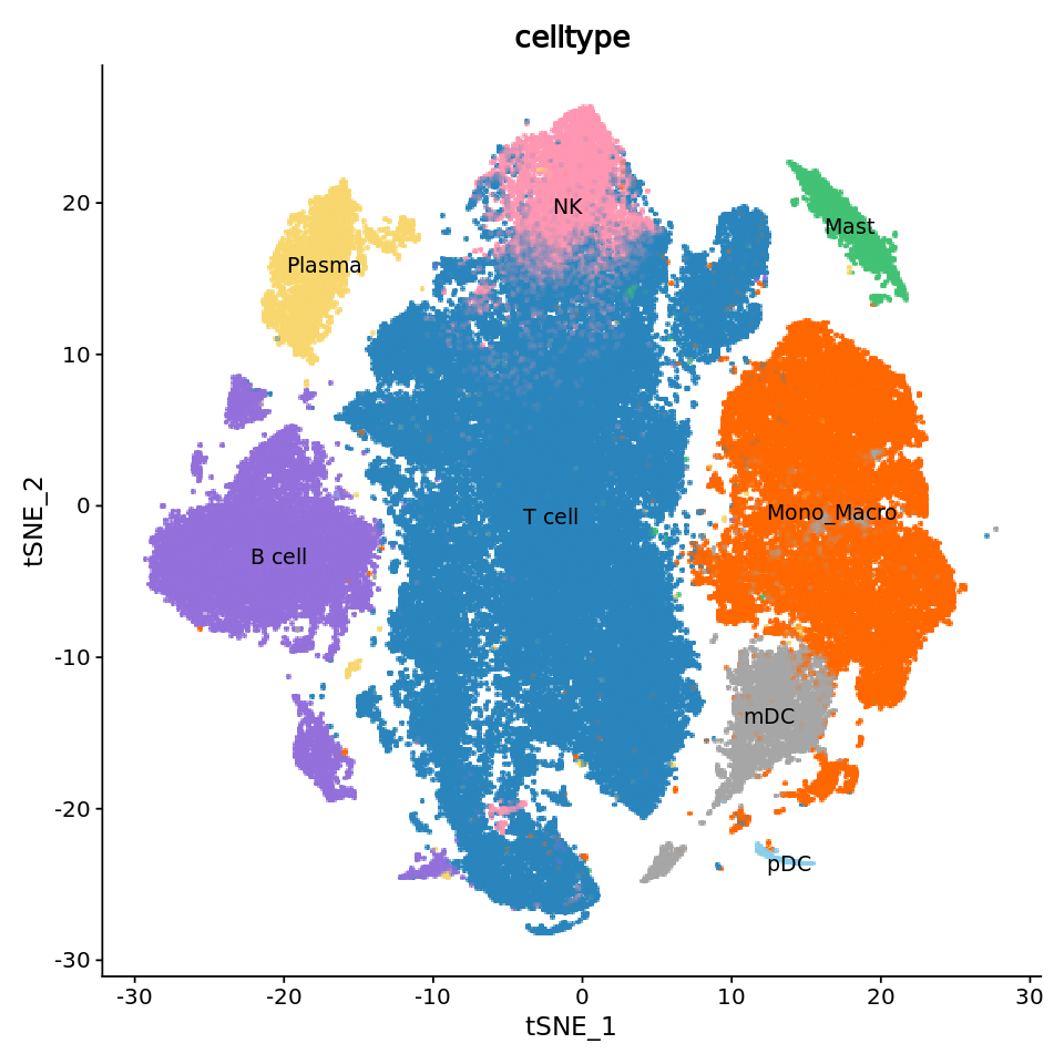
p1 <- DimPlot(obj,
reduction = "tsne", # Use tSNE reduction results
cols = celltype_colors, # Use predefined color scheme
label = T, # Show labels
label.size = 4, # Label size
pt.size = 2.0, # Point size
group.by = "celltype") # Group by cell type
# Remove legend
p1 <- p1 + guides(color = FALSE)
p1output
Rasterizing points since number of points exceeds 100,000.
To disable this behavior set \`raster=FALSE\`
Warning message:
“The scale argument of \`guides()\` cannot be \`FALSE\`. Use "none" instead as
of ggplot2 3.3.4.”
To disable this behavior set \`raster=FALSE\`
Warning message:
“The scale argument of \`guides()\` cannot be \`FALSE\`. Use "none" instead as
of ggplot2 3.3.4.”
R
###################
# Draw improved tSNE plot #
###################
# Set figure size
options(repr.plot.height=8, repr.plot.width=8)
# Get tSNE coordinate range
tsne_coords <- FetchData(obj, vars = c("tSNE_1", "tSNE_2"))
x_range <- range(tsne_coords$tSNE_1)
y_range <- range(tsne_coords$tSNE_2)
# Calculate axis start and end positions
x_start <- x_range[1] * 1.1 # x-axis start, extend left by 10%
x_end <- x_range[2] * 0.001 # x-axis end
y_start <- y_range[1] * 1.1 # y-axis start, extend down by 10%
y_end <- y_range[2] * 0.001 # y-axis end
# Calculate axis label positions
x_middle <- (x_start + x_end) / 2 # x-axis label position
y_middle <- (y_start + y_end) / 2 # y-axis label position
# Create improved tSNE plot
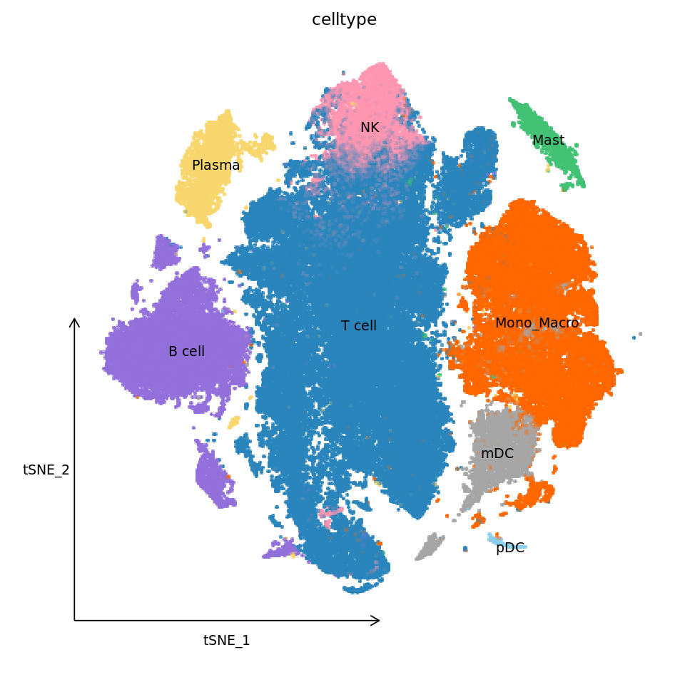
p1_new <- DimPlot(obj,
reduction = "tsne",
cols = celltype_colors,
label = TRUE,
label.size = 4,
pt.size = 2.0,
group.by = "celltype") +
guides(color = FALSE) + # Remove legend
labs(title = "celltype") + # Add title
theme_classic() + # Use classic theme
# Custom theme settings
theme(
axis.line = element_blank(), # Remove axis lines
axis.text = element_blank(), # Remove axis text
axis.ticks = element_blank(), # Remove ticks
axis.title = element_blank(), # Remove axis titles
plot.title = element_text(size = 14, # Set title style
hjust = 0.5,
vjust = 1),
panel.background = element_blank(), # Remove panel background
plot.background = element_blank() # Remove plot background
) +
# Add x-axis line and arrow
annotate("segment",
x = x_start,
xend = x_end,
y = y_start,
yend = y_start,
arrow = arrow(length = unit(0.3, "cm")),
color = "black") +
# Add y-axis line and arrow
annotate("segment",
x = x_start,
xend = x_start,
y = y_start,
yend = y_end,
arrow = arrow(length = unit(0.3, "cm")),
color = "black") +
# Add x-axis label
annotate("text",
x = x_middle,
y = y_start - 2,
label = "tSNE_1",
size = 4) +
# Add y-axis label
annotate("text",
x = x_start - 3,
y = y_middle,
label = "tSNE_2",
angle = 0,
size = 4)
p1_newoutput
Rasterizing points since number of points exceeds 100,000.
To disable this behavior set \`raster=FALSE\`
To disable this behavior set \`raster=FALSE\`
Cell Count Plot
R
#############################
# Count cells and draw bar plot #
#############################
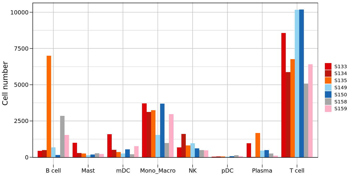
# Count number of cells for each cell type in different samples
counts <- table(obj@meta.data$celltype, obj@meta.data$Patient)
counts_df <- as.data.frame(counts)
# Rename columns
colnames(counts_df) <- c("celltype", "group", "Cell number")
# View data structure
head(counts_df)
unique(counts_df$group)
unique(counts_df$celltype)| celltype | group | Cell number | |
|---|---|---|---|
| <fct> | <fct> | <int> | |
| 1 | B cell | S133 | 439 |
| 2 | Mast | S133 | 1001 |
| 3 | mDC | S133 | 1586 |
| 4 | Mono_Macro | S133 | 3712 |
| 5 | NK | S133 | 684 |
| 6 | pDC | S133 | 31 |
- S133
- S134
- S135
- S149
- S150
- S158
- S159
Levels:
- 'S133'
- 'S134'
- 'S135'
- 'S149'
- 'S150'
- 'S158'
- 'S159'
- B cell
- Mast
- mDC
- Mono_Macro
- NK
- pDC
- Plasma
- T cell
Levels:
- 'B cell'
- 'Mast'
- 'mDC'
- 'Mono_Macro'
- 'NK'
- 'pDC'
- 'Plasma'
- 'T cell'
R
# Set figure size
options(repr.plot.height=6, repr.plot.width=12)
# Create first version bar plot
p2 <- ggplot(counts_df, aes(x = celltype, y = `Cell number`, fill = group)) +
  # Create grouped bar plot
  geom_bar(stat = "identity", position = position_dodge(width = 0.9)) +
  # Set fill color and legend label
  scale_fill_manual(values = group_colors,
                    labels = c('S133','S134','S135','S149','S150','S158','S159'),
                    breaks = c('S133','S134','S135','S149','S150','S158','S159')) +
  # Set axis labels
  labs(x = NULL, y = "Cell number", fill = "") +
  theme_minimal() +
  # Custom theme settings
  theme(
    panel.grid = element_line(colour = "gray", size = 0.5),     # Grid line settings
    axis.text.x = element_text(color = "black", size = 14),     # x-axis text
    axis.text.y = element_text(color = "black", size = 14),     # y-axis text
    axis.title.x = element_text(color = "black", size = 18),    # x-axis title
    axis.title.y = element_text(color = "black", size = 18),    # y-axis title
    axis.ticks = element_line(color = "black", size = 0.5, lineend = "butt"),  # Ticks
    axis.ticks.length = unit(0.25, "cm"),                       # Tick length
    legend.text = element_text(size = 12),                      # Legend text
    legend.title = element_text(size = 14)                      # Legend title
  ) +
  # Add border
  geom_rect(xmin = 0.41, xmax = 8.6, ymin = -10, ymax = 10650,
            fill = "transparent",
            color = "black",
            size = 0.3)
p2
output
Warning message:
“The \`size\` argument of \`element_line()\` is deprecated as of ggplot2 3.4.0.
ℹ Please use the \`linewidth\` argument instead.”
Warning message:
“Using \`size\` aesthetic for lines was deprecated in ggplot2 3.4.0.
ℹ Please use \`linewidth\` instead.”
“The \`size\` argument of \`element_line()\` is deprecated as of ggplot2 3.4.0.
ℹ Please use the \`linewidth\` argument instead.”
Warning message:
“Using \`size\` aesthetic for lines was deprecated in ggplot2 3.4.0.
ℹ Please use \`linewidth\` instead.”
R
# Reorder group levels
counts_df$group <- factor(counts_df$group,
                         levels = c('S149','S134','S135','S133','S150','S158','S159'))
# Create second version bar plot (after reordering)
options(repr.plot.height=6, repr.plot.width=12)
p2<-ggplot(counts_df, aes(x = celltype, y = `Cell number`, fill = group)) +
  geom_bar(stat = "identity", position = position_dodge(width = 0.9)) +
  scale_fill_manual(values = group_colors) +
  labs(x = NULL, y = "Cell number", fill = "") +
  theme_minimal() +
  theme(
    panel.grid = element_line(colour = "gray", size = 0.5),
    axis.text.x = element_text(color = "black", size = 14),
    axis.text.y = element_text(color = "black", size = 14),
    axis.title.x = element_text(color = "black", size = 18),
    axis.title.y = element_text(color = "black", size = 18),
    axis.ticks = element_line(color = "black", size = 0.5, lineend = "butt"),
    axis.ticks.length = unit(0.25, "cm"),
    legend.text = element_text(size = 12),
    legend.title = element_text(size = 14)
  ) +
  geom_rect(xmin = 0.41, xmax = 8.6, ymin = -15, ymax = 10650,
            fill = "transparent",  # Fill transparent
            color = "black",       # Border color black
            size = 0.3)              # Border width 1
p2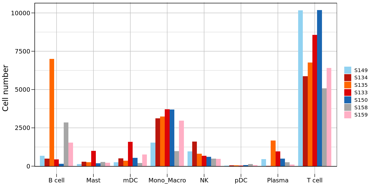
R
# Reorder cell types
counts_df$celltype <- factor(counts_df$celltype,
                         levels = c('T cell','Mono_Macro','NK','mDC','Plasma','Mast','B cell','pDC'))
# Create third version bar plot (after reordering)
options(repr.plot.height=6, repr.plot.width=12)
p2<-ggplot(counts_df, aes(x = celltype, y = `Cell number`, fill = group)) +
  geom_bar(stat = "identity", position = position_dodge(width = 0.9)) +
  scale_fill_manual(values = group_colors) +
  labs(x = NULL, y = "Cell number", fill = "") +
  theme_minimal() +
  theme(
    panel.grid = element_line(colour = "gray", size = 0.5),
    axis.text.x = element_text(color = "black", size = 14),
    axis.text.y = element_text(color = "black", size = 14),
    axis.title.x = element_text(color = "black", size = 18),
    axis.title.y = element_text(color = "black", size = 18),
    axis.ticks = element_line(color = "black", size = 0.5, lineend = "butt"),
    axis.ticks.length = unit(0.25, "cm"),
    legend.text = element_text(size = 12),
    legend.title = element_text(size = 14)
  ) +
  geom_rect(xmin = 0.41, xmax = 8.6, ymin = -15, ymax = 10650,
            fill = "transparent",  # Fill transparent
            color = "black",       # Border color black
            size = 0.3)              # Border width 1
p2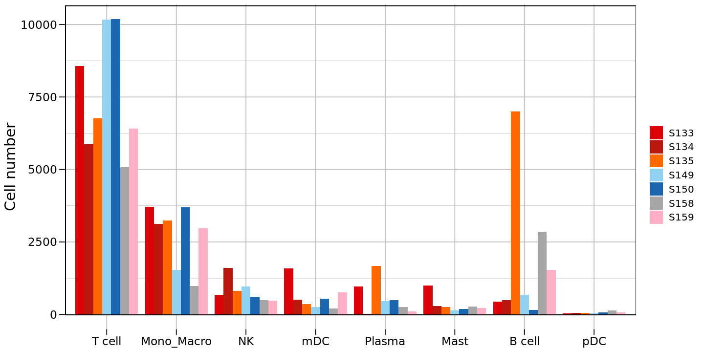
Cell Proportion Stacked Plot
R
## Cell Proportion Stacked Plot| group | celltype | |
|---|---|---|
| <chr> | <chr> | |
| 1 | S150 | T cell |
| 2 | S150 | Mono_Macro |
| 3 | S150 | T cell |
| 4 | S150 | T cell |
| 5 | S150 | T cell |
| 6 | S150 | T cell |
- 'T cell'
- 'Mono_Macro'
- 'NK'
- 'mDC'
- 'Plasma'
- 'Mast'
- 'B cell'
- 'pDC'
- 'S150'
- 'S133'
- 'S134'
- 'S135'
- 'S158'
- 'S159'
- 'S149'
R
# Calculate proportion of different cell types in each sample
tbl <- celltype_group_df %>%
  group_by(group, celltype) %>%                  # Group by group and cell type
  summarise(Count = n()) %>%                     # Calculate cell count per group
  group_by(group) %>%                           # Group by group
  mutate(Percent = Count / sum(Count) * 100)    # Calculate percentage
output
\`summarise()\` has grouped output by 'group'. You can override using the
\`.groups\` argument.
\`.groups\` argument.
R
# Draw first version stacked bar plot
options(repr.plot.height=8, repr.plot.width=8)
p3 <- ggplot(tbl, aes(x = group, fill = celltype, y = Percent)) +
  geom_bar(stat = "identity") +                 # Create stacked bar chart
  theme_bw() +                                  # Use black and white theme
  scale_fill_manual(values = celltype_colors) + # Use predefined colors
  xlab(NULL) +                                  # Hide x-axis title
  ylab("Percent(%)") +                         # y-axis title
  labs(fill = "celltype") +                    # Legend title
  # Custom theme settings
  theme(axis.text.x  = element_text(color = "black", vjust = 1, hjust = 1, angle = 45),
        panel.grid = element_blank(),           # Remove grid lines
        legend.text = element_text(size = 12),  # Legend text size
        legend.title = element_text(size = 12), # Legend title size
        axis.text = element_text(size = 14),    # Axis text size
        axis.title = element_text(size = 14))   # Axis title size
p3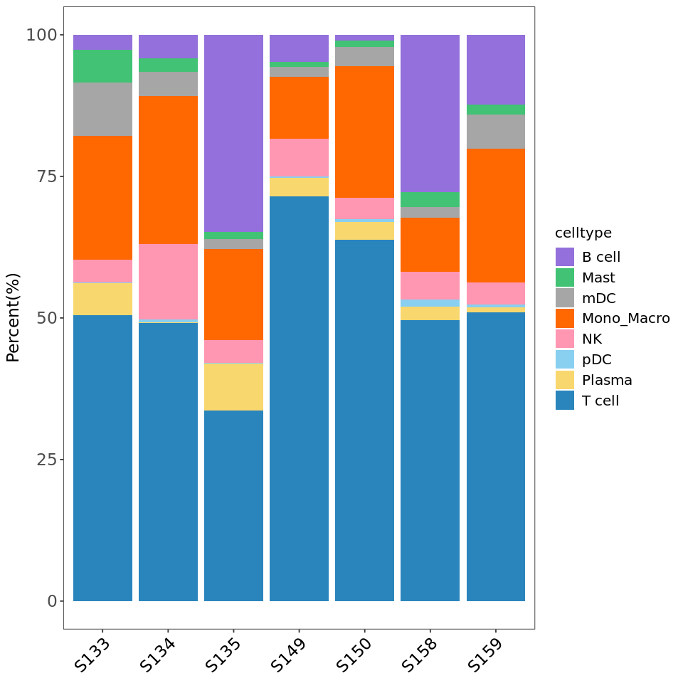
R
# Reorder group levels
tbl$group <- factor(tbl$group,
                      levels = c('S149','S134','S135','S133','S150','S158','S159'))
# Draw second version stacked bar plot (after reordering)
options(repr.plot.height=8, repr.plot.width=8)
p3 <- ggplot(tbl, aes(x = group, fill = celltype, y = Percent)) +
  geom_bar(stat = "identity") +
  theme_bw() +
  scale_fill_manual(values = celltype_colors) +
  xlab(NULL) +
  ylab("Percent(%)") +
  labs(fill = "celltype") +
  theme(axis.text.x  = element_text(color = "black", vjust = 1, hjust = 1, angle = 45),
        panel.grid = element_blank(),
        legend.text = element_text(size = 12),
        legend.title = element_text(size = 12),
        axis.text = element_text(size = 14),
        axis.title = element_text(size = 14))
p3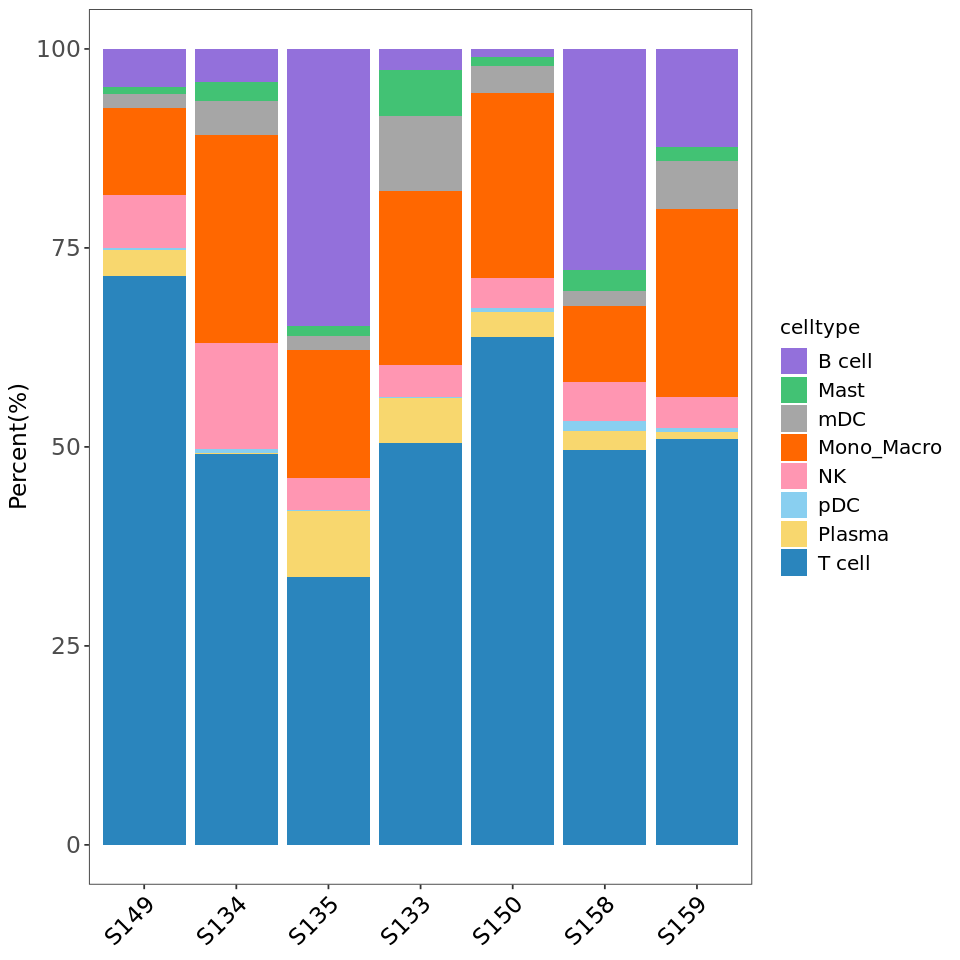
R
# Reorder cell types
tbl$celltype <- factor(tbl$celltype,
                      levels = c('T cell','Mono_Macro','NK','mDC','Plasma','Mast','B cell','pDC'))
# Draw third version stacked bar plot (after reordering)
options(repr.plot.height=8, repr.plot.width=8)
p3 <- ggplot(tbl, aes(x = group, fill = celltype, y = Percent)) +
  geom_bar(stat = "identity") +
  theme_bw() +
  scale_fill_manual(values = celltype_colors) +
  xlab(NULL) +
  ylab("Percent(%)") +
  labs(fill = "celltype") +
  theme(axis.text.x  = element_text(color = "black", vjust = 1, hjust = 1, angle = 45),
        panel.grid = element_blank(),
        legend.text = element_text(size = 12),
        legend.title = element_text(size = 12),
        axis.text = element_text(size = 14),
        axis.title = element_text(size = 14))
p3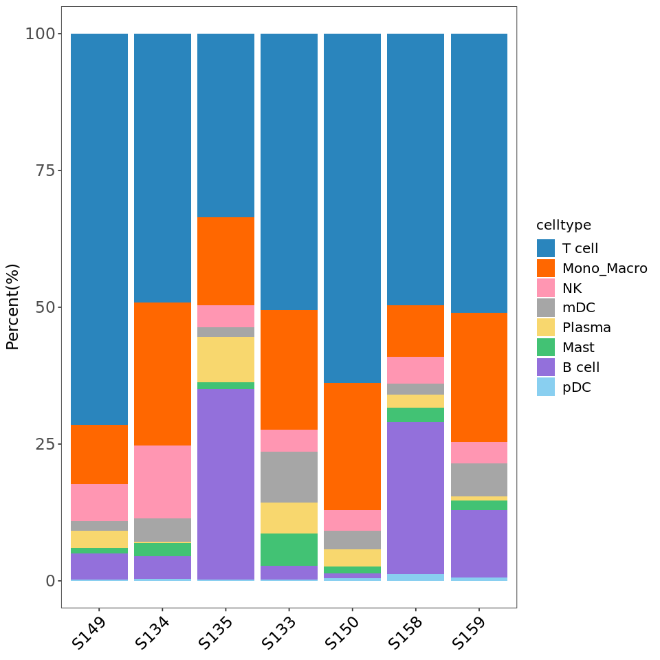
R
###################
# Save all plots #
###################

# Save tSNE plot
ggsave("tsne.pdf", plot = p1_new, width = 8, height = 8)
# Save cell count bar plot
ggsave("cellnumber.pdf", plot = p2, width = 12, height = 6)
# Save cell proportion stacked plot
ggsave("cellratio.pdf", plot = p3, width = 8, height = 8)