Single-cell Host-Virus Interaction: Correlation between Viral and Host Gene Expression
By observing the correlation between viral gene expression and key host genes, we explore the interaction between viral and host genes to understand how viruses affect host cell functions.
#######################################
  # Select Jupyter script execution environment as copyKAT #
######################################## Load R Packages
library(Seurat) # For single-cell RNA sequencing data analysis
library(dplyr) # For data processing
library(ggpubr) # For statistical analysis and plot beautification
library(patchwork) # For combining multiple ggplot figuresseurat.obj <- readRDS("data/AY1747290423554/input.rds") # Read original Seurat object
meta <- read.table("data/AY1747290423554/meta.tsv", header=T, sep="\t", row.names = 1) # Read cell metadata
obj <- AddMetaData(seurat.obj, meta) # Add metadata to Seurat object
DefaultAssay(obj) = "RNA" # Set default assay to RNA expression data# Read and process simulated viral expression data
virus_expression = read.delim("sim_virus.matrix") # Read simulated virus expression matrix
virus_expression[1:3,1:3] # View first 3 rows and 3 columns of virus expression matrix
virus_expression = Matrix::as.matrix(virus_expression) # Convert dataframe to matrix format| AAACCTGAGATACACA.1_1 | AAACCTGAGCTAACTC.1_1 | AAACCTGAGGAGCGAG.1_1 | |
|---|---|---|---|
| <int> | <int> | <int> | |
| virus-gene1 | 26 | 11 | 19 |
| virus-gene2 | 32 | 58 | 44 |
| virus-gene3 | 26 | 32 | 30 |
# Merge viral expression data with original expression data
combined_counts <- rbind(
  GetAssayData(obj, slot="counts"),  # Get raw count matrix
  virus_expression  # Add virus expression data
)“The \`slot\` argument of \`GetAssayData()\` is deprecated as of SeuratObject 5.0.0.
ℹ Please use the \`layer\` argument instead.”
# Create new Seurat object and preprocess
new_obj <- CreateSeuratObject(counts = combined_counts)  # Create new Seurat object using combined data
new_obj@meta.data <- obj@meta.data  # Copy metadata from original object
new_obj@reductions <- obj@reductions  # Copy dimension reduction results from original object
new_obj <- NormalizeData(new_obj) # Normalize data# View grouping information in data
unique(new_obj@meta.data$Tissue) # View tissue type
unique(new_obj@meta.data$Patient) # View patient ID
unique(new_obj@meta.data$celltype) # View cell types- 'Tumor'
- 'Adjacent'
- 'S150'
- 'S133'
- 'S134'
- 'S135'
- 'S158'
- 'S159'
- 'S149'
- 'T cell'
- 'Mono_Macro'
- 'NK'
- 'mDC'
- 'Plasma'
- 'Other'
- 'Mast'
- 'B cell'
- 'pDC'
# Select cells and genes of interest
cells_of_interest <- WhichCells(new_obj,
expression = Patient == "S150" & celltype == "T cell") # Select T cells from patient S150# Define list of genes of interest (host genes associated with viral infection)
genes_of_interest <- c("DDX58", "IFIH1", "XBP1","TNF","OAS1")
# Extract expression data
expression_data <- GetAssayData(new_obj, slot = "data")[genes_of_interest, cells_of_interest] # Get normalized expression values of selected genes in selected cells
viral_umi <- GetAssayData(new_obj, slot = "counts")["virus-gene1", cells_of_interest] # Get raw counts of virus gene in selected cells# Define function to create correlation plots
create_correlation_plot <- function(gene_expr, viral_counts, gene_name) {
# Prepare plotting data
plot_data <- data.frame(
viral_umi = log10(as.numeric(viral_counts) + 1), # Log10 transform virus expression
gene_expression = as.numeric(gene_expr) # Host gene expression
)
# Calculate Pearson correlation and p-value
cor_test <- cor.test(plot_data$viral_umi, plot_data$gene_expression, method = "pearson")
R_value <- round(cor_test$estimate, 2) # Round correlation coefficient to 2 decimal places
# Convert p-value to scientific notation
p_exp <- floor(log10(cor_test$p.value)) # Calculate exponent
p_base <- round(cor_test$p.value / 10^p_exp, 1) # Calculate base
p_value <- paste0(p_base, "×10", p_exp) # Combine into final format
# Create scatter plot
p <- ggplot(plot_data, aes(x = viral_umi, y = gene_expression)) +
theme_gray() + # Use gray theme
theme(
panel.background = element_rect(fill = "grey92"), # Set panel background color
panel.grid.major = element_line(color = "white", linewidth = 0.8), # Major grid lines
panel.grid.minor = element_line(color = "white", linewidth = 0.6), # Minor grid lines
panel.border = element_blank(), # Remove border
axis.line = element_blank(), # Remove axis lines
axis.text = element_text(size = 12, color = "black"), # Axis label text
axis.title = element_text(size = 14, color = "black"), # Axis title text
plot.title = element_blank() # Remove title
) +
geom_point(color = "#69b3a2", alpha = 0.8, size = 2) + # Add scatter points
geom_smooth(method = "lm", color = "blue", se = TRUE, alpha = 0.4) + # Add regression line
# Add correlation statistics
annotate("text",
x = max(plot_data$viral_umi) * 0.8,
y = max(plot_data$gene_expression) * 0.9,
label = paste0("R = ", R_value, "\np = ", p_value),
hjust = 0) +
# Set axis labels
labs(
x = "Number of viral UMIs (log10)",
y = gene_name
)+
scale_y_continuous(labels = scales::number_format(accuracy = 0.1)) # Set y-axis number format
return(p)
}# Use patchwork to create combined plot
options(repr.plot.height=12, repr.plot.width=18)
combined_plot <- wrap_plots(
lapply(seq_along(genes_of_interest), function(i) {
create_correlation_plot(expression_data[i,], viral_umi, genes_of_interest[i])
}),
ncol = 3, # Set 3 columns
nrow = 2 # Set 2 rows
)
# Display combined plot
combined_plot\`geom_smooth()\` using formula = 'y ~ x'
\`geom_smooth()\` using formula = 'y ~ x'
\`geom_smooth()\` using formula = 'y ~ x'
\`geom_smooth()\` using formula = 'y ~ x'
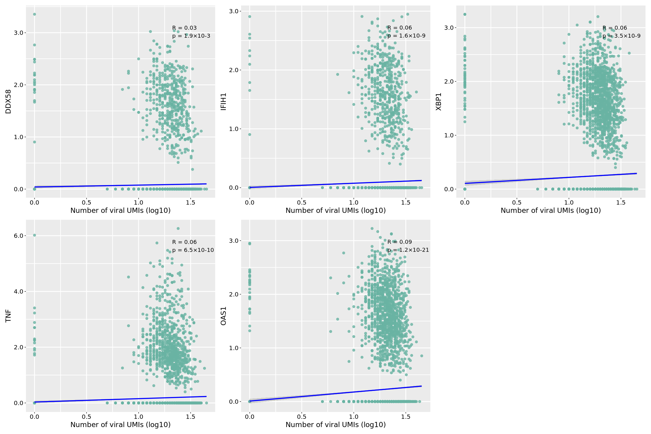
Image Legend: This analysis uses simulated viral expression data to analyze the correlation between a viral gene (virus-gene1) and five key host immune-related genes at the single-cell level. In the plots, the x-axis represents viral gene expression (log10 transformed UMI counts), and the y-axis represents the normalized expression value of each host gene. Each dot represents a single cell, and the distribution reflects the relationship between viral and host gene expression. The blue regression line indicates the overall trend, with the surrounding gray area representing the 95% confidence interval; a narrower interval indicates more accurate prediction.
In the top right corner of each scatter plot, we see two key statistical metrics: correlation coefficient (R value) and significance level (p value). R ranges from -1 to 1; positive values indicate positive correlation (host gene expression increases with viral expression), negative values indicate negative correlation. |R| closer to 1 indicates stronger correlation. p value is in scientific notation (e.g., 1.2×10^-4), indicating statistical significance; p<0.05 is typically considered statistically significant.
Specifically for each gene:
- Viral Recognition Receptor Genes: DDX58 (RIG-I): As a cytoplasmic viral RNA recognition receptor, its expression shows a significant positive correlation with the virus, suggesting viral infection may trigger RIG-I mediated innate immune response. IFIH1 (MDA5): Another important viral RNA sensor, its expression correlation reflects the intensity of cellular recognition of viral RNA.
- Cellular Stress Response: XBP1: As a key transcription factor in endoplasmic reticulum stress, its expression correlation reveals the degree of cellular stress induced by viral infection.
- Inflammation and Immune Response: TNF: As an important pro-inflammatory factor, its expression correlation reflects the intensity of the inflammatory response induced by viral infection. OAS1: As an interferon-stimulated gene, its expression correlation indicates the activation level of the cellular antiviral state. The data shows that these immune-related genes generally exhibit a positive correlation with viral expression, suggesting that viral infection may systematically activate host immune defense mechanisms. The scatter pattern also reflects heterogeneity at the single-cell level, meaning not all cells respond to viral infection in the same way.
Note that this analysis uses simulated viral expression data, primarily to demonstrate methods and visualization. While these patterns align with immunological expectations, actual biological significance requires experimental validation. This approach helps researchers understand host immune response characteristics during viral infection, providing clues for subsequent mechanistic studies.
# Save plot as PDF
ggsave(combined_plot, file = "correlation.pdf", width = 18, height = 12)\`geom_smooth()\` using formula = 'y ~ x'
\`geom_smooth()\` using formula = 'y ~ x'
\`geom_smooth()\` using formula = 'y ~ x'
\`geom_smooth()\` using formula = 'y ~ x'