单细胞宿主-病毒互作:病毒基因与宿主基因表达相关性
时长: 9 分钟
字数: 2.2k 字
更新: 2026-02-27
阅读: 0 次
通过观察病毒基因表达与关键宿主基因的相关性,探究病毒基因和宿主基因之间的互作关系,理解病毒如何影响宿主细胞功能
R
#######################################
  #选择jupyter脚本执行环境为 copyKAT#
#######################################
R
# 加载R包
library(Seurat)      # 用于单细胞RNA测序数据分析
library(dplyr)       # 用于数据处理
library(ggpubr)      # 用于统计分析和图形美化
library(patchwork)   # 用于组合多个ggplot图形
R
seurat.obj <- readRDS("data/AY1747290423554/input.rds")   # 读取原始Seurat对象
meta <- read.table("data/AY1747290423554/meta.tsv", header=T, sep="\t", row.names = 1)  # 读取细胞元数据
obj <- AddMetaData(seurat.obj, meta)  # 将元数据添加到Seurat对象中
DefaultAssay(obj) = "RNA"  # 设置默认分析数据为RNA表达数据
R
# 读取并处理模拟的病毒表达数据
virus_expression = read.delim("sim_virus.matrix")  # 读取模拟的病毒表达矩阵
virus_expression[1:3,1:3]  # 查看病毒表达矩阵的前3行和前3列
virus_expression = Matrix::as.matrix(virus_expression) # 将数据框转换为矩阵格式| AAACCTGAGATACACA.1_1 | AAACCTGAGCTAACTC.1_1 | AAACCTGAGGAGCGAG.1_1 | |
|---|---|---|---|
| <int> | <int> | <int> | |
| virus-gene1 | 26 | 11 | 19 |
| virus-gene2 | 32 | 58 | 44 |
| virus-gene3 | 26 | 32 | 30 |
R
# 合并病毒表达数据和原始表达数据
combined_counts <- rbind(
  GetAssayData(obj, slot="counts"),  # 获取原始计数矩阵
  virus_expression  # 添加病毒表达数据
)
output
Warning message:
“The \`slot\` argument of \`GetAssayData()\` is deprecated as of SeuratObject 5.0.0.
ℹ Please use the \`layer\` argument instead.”
“The \`slot\` argument of \`GetAssayData()\` is deprecated as of SeuratObject 5.0.0.
ℹ Please use the \`layer\` argument instead.”
R
# 创建新的Seurat对象并进行预处理
new_obj <- CreateSeuratObject(counts = combined_counts)  # 使用合并后的数据创建新的Seurat对象
new_obj@meta.data <- obj@meta.data  # 复制原始对象的元数据
new_obj@reductions <- obj@reductions  # 复制原始对象的降维结果
new_obj <- NormalizeData(new_obj)  # 对数据进行标准化
output
Normalizing layer: counts
R
# 查看数据中的分组信息
unique(new_obj@meta.data$Tissue)    # 查看组织类型
unique(new_obj@meta.data$Patient)   # 查看病人ID
unique(new_obj@meta.data$celltype) # 查看细胞类型- 'Tumor'
- 'Adjacent'
- 'S150'
- 'S133'
- 'S134'
- 'S135'
- 'S158'
- 'S159'
- 'S149'
- 'T cell'
- 'Mono_Macro'
- 'NK'
- 'mDC'
- 'Plasma'
- 'Other'
- 'Mast'
- 'B cell'
- 'pDC'
R
# 选择感兴趣的细胞和基因
cells_of_interest <- WhichCells(new_obj,
    expression = Patient == "S150" & celltype == "T cell")  # 选择S150患者的T细胞
R
# 定义感兴趣的基因列表(与病毒感染相关的宿主基因)
genes_of_interest <- c("DDX58", "IFIH1", "XBP1","TNF","OAS1")

# 提取表达数据
expression_data <- GetAssayData(new_obj, slot = "data")[genes_of_interest, cells_of_interest]  # 获取选定基因在选定细胞中的标准化表达值
viral_umi <- GetAssayData(new_obj, slot = "counts")["virus-gene1", cells_of_interest]  # 获取病毒基因在选定细胞中的原始计数
R
# 定义创建相关性图的函数
create_correlation_plot <- function(gene_expr, viral_counts, gene_name) {
    # 准备绘图数据
    plot_data <- data.frame(
        viral_umi = log10(as.numeric(viral_counts) + 1),  # 病毒表达量取log10
        gene_expression = as.numeric(gene_expr)  # 宿主基因表达量
    )

    # 计算Pearson相关性和p值
    cor_test <- cor.test(plot_data$viral_umi, plot_data$gene_expression, method = "pearson")
    R_value <- round(cor_test$estimate, 2)  # 相关系数保留两位小数
    # 将p值转换为科学计数法
    p_exp <- floor(log10(cor_test$p.value))  # 计算指数
    p_base <- round(cor_test$p.value / 10^p_exp, 1)  # 计算底数
    p_value <- paste0(p_base, "×10", p_exp)  # 组合成最终格式

    # 创建散点图
    p <- ggplot(plot_data, aes(x = viral_umi, y = gene_expression)) +
        theme_gray() +  # 使用灰色主题
        theme(
            panel.background = element_rect(fill = "grey92"),  # 设置面板背景色
            panel.grid.major = element_line(color = "white", linewidth = 0.8),  # 主网格线
            panel.grid.minor = element_line(color = "white", linewidth = 0.6),  # 次网格线
            panel.border = element_blank(),  # 移除边框
            axis.line = element_blank(),     # 移除轴线
            axis.text = element_text(size = 12, color = "black"),  # 轴标签文字
            axis.title = element_text(size = 14, color = "black"),  # 轴标题文字
            plot.title = element_blank()  # 移除标题
        ) +
        geom_point(color = "#69b3a2", alpha = 0.8, size = 2) +  # 添加散点
        geom_smooth(method = "lm", color = "blue", se = TRUE, alpha = 0.4) +  # 添加回归线
        # 添加相关性统计信息
        annotate("text",
                x = max(plot_data$viral_umi) * 0.8,
                y = max(plot_data$gene_expression) * 0.9,
                label = paste0("R = ", R_value, "\np = ", p_value),
                hjust = 0) +
        # 设置轴标签
        labs(
            x = "Number of viral UMIs (log10)",
            y = gene_name
        )+
        scale_y_continuous(labels = scales::number_format(accuracy = 0.1))  # 设置y轴数字格式
    return(p)
}
R
# 使用patchwork创建组合图
options(repr.plot.height=12, repr.plot.width=18)
combined_plot <- wrap_plots(
    lapply(seq_along(genes_of_interest), function(i) {
        create_correlation_plot(expression_data[i,], viral_umi, genes_of_interest[i])
    }),
    ncol = 3,  # 设置3列
    nrow = 2   # 设置2行
)

# 显示组合图
combined_plot
output
\`geom_smooth()\` using formula = 'y ~ x'
\`geom_smooth()\` using formula = 'y ~ x'
\`geom_smooth()\` using formula = 'y ~ x'
\`geom_smooth()\` using formula = 'y ~ x'
\`geom_smooth()\` using formula = 'y ~ x'
\`geom_smooth()\` using formula = 'y ~ x'
\`geom_smooth()\` using formula = 'y ~ x'
\`geom_smooth()\` using formula = 'y ~ x'
\`geom_smooth()\` using formula = 'y ~ x'
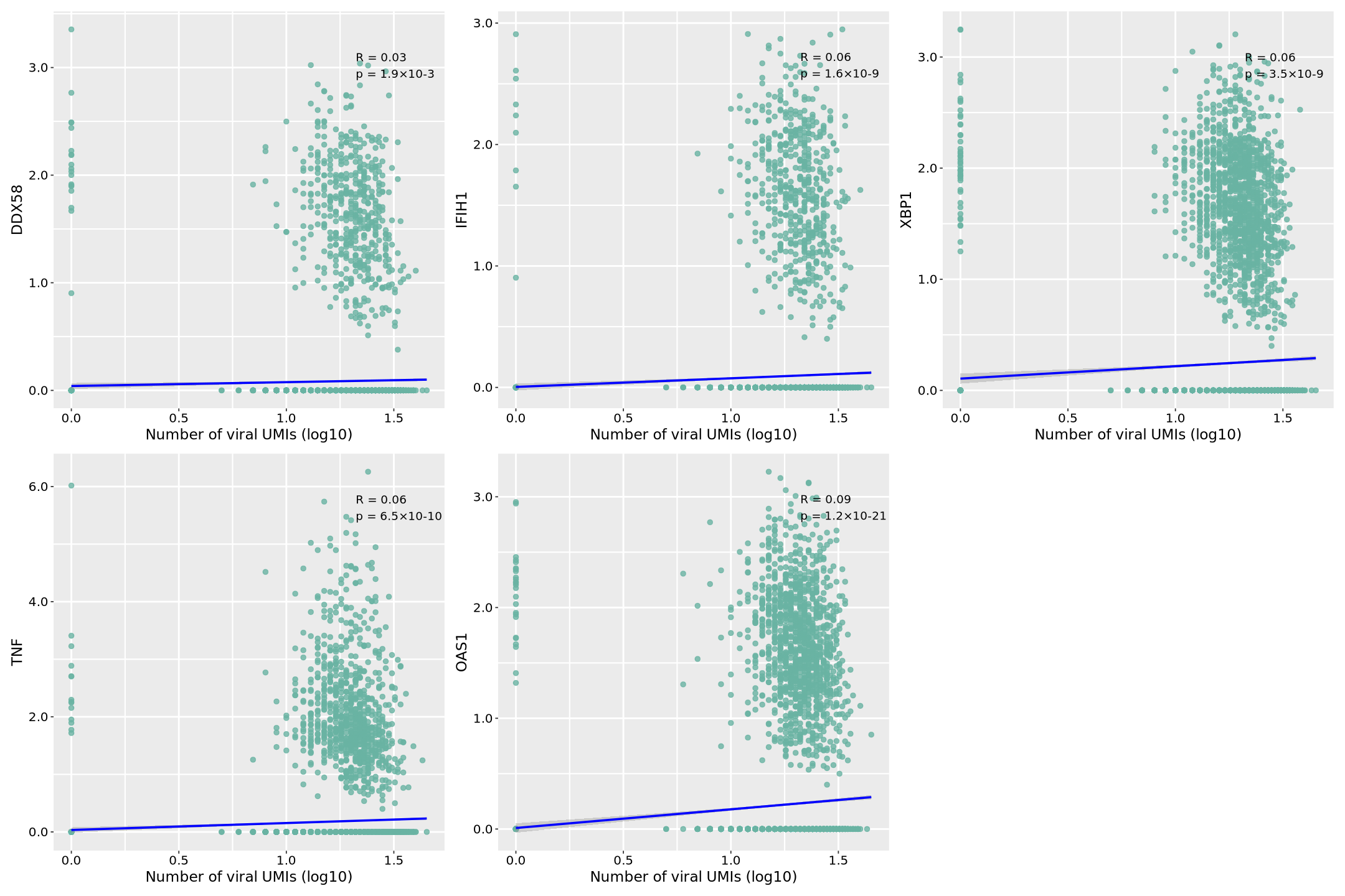
图片释义: 本次使用模拟的病毒表达数据,分析了病毒基因(virus-gene1)与五个关键宿主免疫相关基因在单细胞水平的表达相关性。图中,横轴表示病毒基因的表达量(经过 log10 转换的 UMI 计数),纵轴表示各个宿主基因的标准化表达值。每个点代表一个单细胞,点的分布反映了病毒和宿主基因表达的关系。蓝色回归线表示整体趋势,其周围的灰色区域表示 95%置信区间,区间越窄表明预测越准确。
在每个散点图的右上角,我们可以看到两个关键统计指标:相关系数(R 值)和显著性水平(p 值)。R 值范围从-1 到 1,正值表示正相关(即病毒表达增加时宿主基因表达也增加),负值表示负相关。|R|值越接近 1 表示相关性越强。p 值采用科学计数法表示(如 1.2×10^-4),表示相关性的统计显著性,p<0.05 通常被认为具有统计学意义。
具体到各个基因:
- 病毒识别受体基因: DDX58(RIG-I):作为细胞质内病毒 RNA 识别受体,其表达与病毒呈现显著正相关,表明病毒感染可能触发了 RIG-I 介导的先天性免疫应答。 IFIH1(MDA5):另一个重要的病毒 RNA 传感器,其表达相关性反映了细胞对病毒 RNA 的识别强度。
- 细胞应激响应: XBP1:作为内质网应激的关键转录因子,其表达相关性揭示了病毒感染导致的细胞应激程度。
- 炎症和免疫响应: TNF:作为重要的促炎症因子,其表达相关性反映了病毒感染诱导的炎症反应强度。 OAS1:作为干扰素刺激基因,其表达相关性表明了细胞抗病毒状态的激活程度。 数据显示,这些免疫相关基因与病毒表达普遍呈现正相关关系,暗示病毒感染可能系统性地激活了宿主的免疫防御机制。散点的分布模式也反映了单细胞水平的异质性,即并非所有细胞都以相同的方式响应病毒感染。
需要注意的是,本分析使用的是模拟的病毒表达数据,主要用于展示分析方法和可视化效果。这些相关性模式虽然符合免疫学理论预期,但实际的生物学意义需要通过实验数据验证。这种分析方法可以帮助研究人员理解病毒感染过程中宿主细胞的免疫应答特征,为后续的机制研究提供线索。
R
# 保存图片为PDF文件
ggsave(combined_plot, file = "correlation.pdf", width = 18, height = 12)
output
\`geom_smooth()\` using formula = 'y ~ x'
\`geom_smooth()\` using formula = 'y ~ x'
\`geom_smooth()\` using formula = 'y ~ x'
\`geom_smooth()\` using formula = 'y ~ x'
\`geom_smooth()\` using formula = 'y ~ x'
\`geom_smooth()\` using formula = 'y ~ x'
\`geom_smooth()\` using formula = 'y ~ x'
\`geom_smooth()\` using formula = 'y ~ x'
\`geom_smooth()\` using formula = 'y ~ x'