Pseudotime-Dependent Gene Screening Tutorial: Exploring Dynamic Changes in Gene Expression Along Trajectories
Execution Environment
##############################
# Select Jupyter kernel environment as monocle2(R) #
##############################
Load Dependencies
suppressMessages({
library(monocle)
library(Seurat)
library(dplyr)
library(tidyverse)
library(ggplot2)
library(ggsci)
})
Read Analysis Results
# Read monocle2 analysis results
monocle<-readRDS("demo_monocle2/output/monocle2/monocle_final.rds")
Method Notes: Natural Splines in Pseudotime
The sm.ns function specifies that the software should handle gene expression values by fitting natural spline curves. A natural spline is a mathematical function that smoothly connects data points to form a continuous curve.
Differential Analysis
diff_test_res = differentialGeneTest(monocle, fullModelFormulaStr = "~sm.ns(Pseudotime)")# View first 5 rows
head(diff_test_res[,c("gene_short_name", "pval", "qval")])| gene_short_name | pval | qval | |
|---|---|---|---|
| <chr> | <dbl> | <dbl> | |
| AL627309.1 | AL627309.1 | 1.256879e-20 | 1.188652e-19 |
| AL627309.5 | AL627309.5 | 1.474717e-32 | 2.049121e-31 |
| AP006222.2 | AP006222.2 | 8.636056e-02 | 1.579091e-01 |
| AL732372.1 | AL732372.1 | 1.647113e-01 | 2.657367e-01 |
| LINC01409 | LINC01409 | 2.159786e-01 | 3.301703e-01 |
| FAM87B | FAM87B | 8.604796e-02 | 1.574697e-01 |
Results Preview
# Genes selected here are for demo testing (replace with your target genes)
marker_gene = c('LEPR','VCAM1','BGLAP','RUNX2','COL1A1','SPARC','NR4A1','NR4A2')
Select Example Genes
gene_time <- diff_test_res[marker_gene,] %>%
    na.omit() %>%
    pull(gene_short_name) %>%
    as.character()
Extract Pseudotime-Dependent Genes
You can use the plot_genes_in_pseudotime function to plot the expression levels of these genes, which all show significant changes along the differentiation process (pseudotime). This function also provides many cosmetic options that you can use to control the layout and appearance of the plot.
Plot Pseudotime Expression Curves
# Plot gene expression trajectory
p = plot_genes_in_pseudotime(monocle[gene_time,],
                             color_by = "subtype",
                             ncol = 2)
p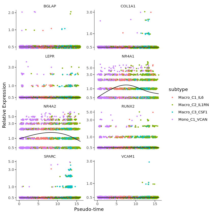
Plot Aesthetics and Faceting
p1 = p +
  facet_wrap(~gene_short_name, scales = "free", ncol = 2) +
  theme(strip.text = element_text(size = 15),
        axis.text.x = element_text(size = 10),
        axis.text.y = element_text(size = 10))+
guides(color = guide_legend(title = "demo"))

p1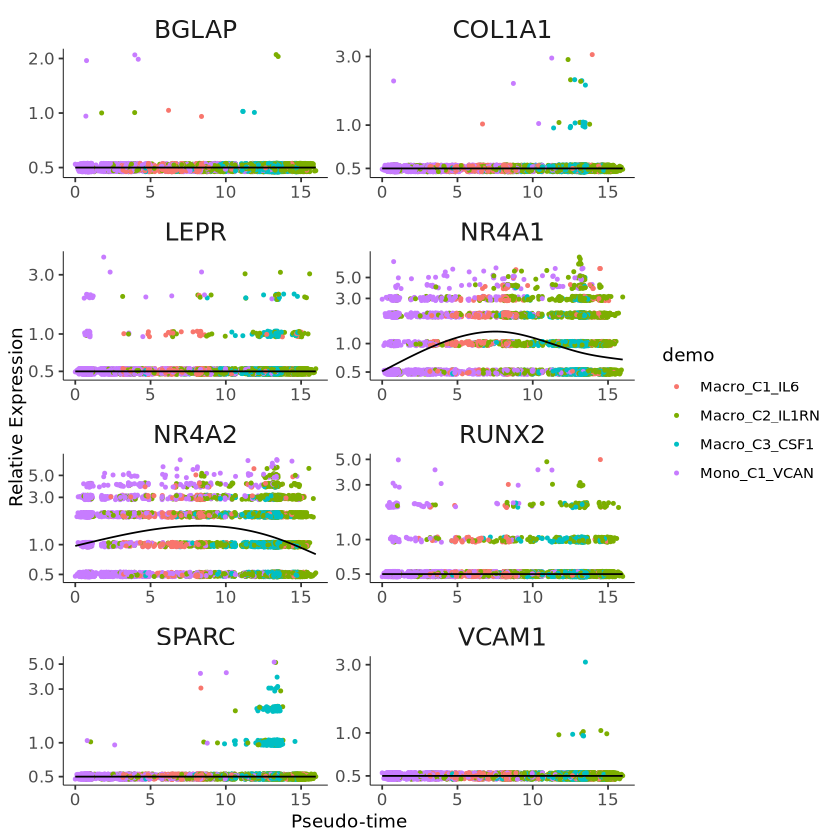
Clustering Genes Based on Pseudotime Expression Patterns
Monocle provides a convenient way to visualize all genes associated with pseudotime. The plot_pseudotime_heatmap function takes a CellDataSet object (usually containing only a subset of significant genes) and generates smooth expression curves like plot_genes_in_pseudotime. It then clusters these genes and plots them using the pheatmap package. This allows you to visualize modules of genes that co-vary along pseudotime.
# Plot heatmap
p2 = plot_pseudotime_heatmap(monocle[gene_time,],
                        num_cluster = 3,
                        show_rownames = T,
                        return_heatmap = T)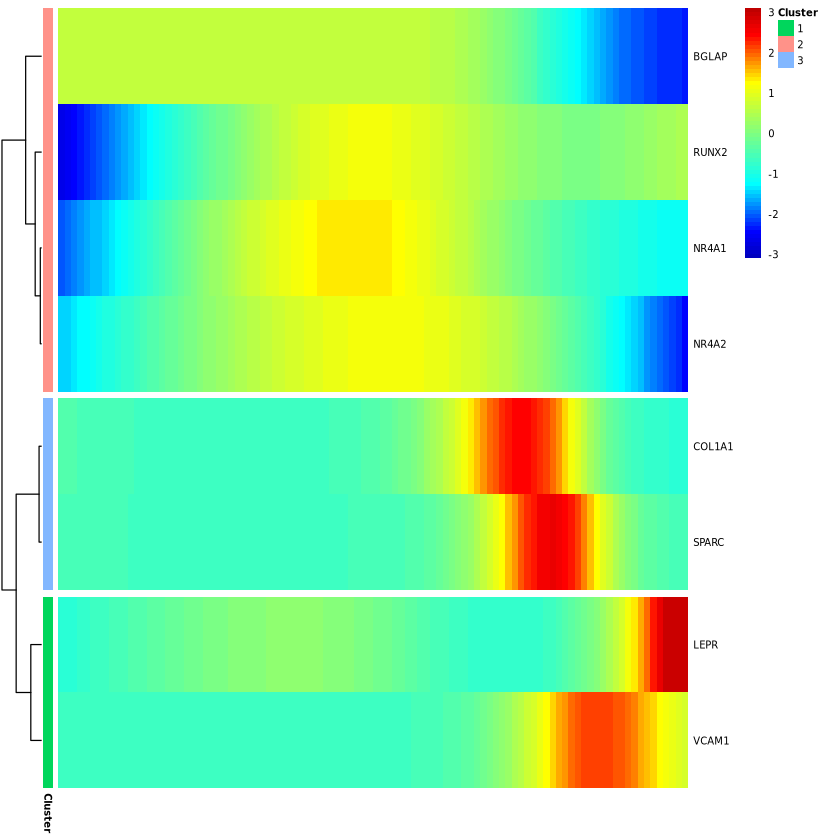
# Save image
ggsave("plot.pdf", p1, width = 8, height = 12)
ggsave("heatmap.pdf", p2, width = 5, height = 6)