SeekSpace Spatial Transcriptomics Multi-Sample Integration and Batch Effect Assessment
Input File Preparation
This module requires the following input files:
Required Files
- Seurat Object File: Released Seurat object (
.rdsformat), containing gene expression matrix and cell metadata.
File Structure Example
./
├── AA1.rds      # Seurat object for Sample 1
├── AA3.rds      # Seurat object for Sample 2
└── ...
Important Note
Input Seurat object should contain the following info:
- Gene expression matrix (counts or data slot)
- Cell metadata (meta.data), including sample ID (
orig.ident)- Cell spatial location info
⚠️ Tiling Processing Reminder
Before analysis, if samples are tiled, bioinformaticians need to split tiles and release analyzable rds data. Ensure input Seurat object files have completed tile splitting.
# --- Import necessary R packages ---
library(Seurat)
library(harmony)
library(dplyr)
library(tibble)
library(tidyverse)
library(ggplot2)Loading required package: Rcpp
Warning message:
“package ‘Rcpp’ was built under R version 4.3.3”
Warning message:
“package ‘dplyr’ was built under R version 4.3.3”
Attaching package: ‘dplyr’
The following objects are masked from ‘package:stats’:
filter, lag
The following objects are masked from ‘package:base’:
intersect, setdiff, setequal, union
Warning message:
“package ‘tibble’ was built under R version 4.3.3”
Data Reading and Integration
This section reads Seurat object files for multiple samples and merges the data.
Data Reading Process
Main Steps:
Define File List: Specify Seurat object files (
.rdsformat) to read, which should contain released spatial transcriptomics data.Loop Read Data:
- Use
readRDS()function to read each sample's Seurat object one by one - Extract and save metadata (
@misc$info) for each sample for subsequent analysis
- Use
Data Merging:
- If only one sample, use that sample's data directly
- If multiple samples, use
merge()function to merge all samples - Use
merge.dr = "spatial"parameter to ensure spatial dimension reduction info is correctly merged - If cell names repeat, Seurat automatically renames to ensure uniqueness
Info Preservation: Merge sample metadata into the integrated Seurat object
Notes:
- Ensure all
.rdsfiles are in the current working directory or specified path - Merged data will contain cell and gene info from all samples
- Merging process automatically handles cell name conflicts
# ============================================================================
# Data Reading and Merging
# ============================================================================

# --- Step 1: Define list of Seurat object files to read ---
# Add filenames of samples to be integrated into the list
# Note: Modify filenames according to actual analysis needs
# Tutorial example: MIA6, MIA7 samples
rds_files <- c("MIA6.rds", "MIA7.rds")

# --- Step 2: Initialize storage list ---
# data_list: Stores Seurat objects for each sample
# info2keep: Stores metadata for each sample (@misc$info)
data_list <- list()
info2keep <- list()

# --- Step 3: Loop to read all Seurat object files ---
# Iterate through file list, read and extract info one by one
for (i in seq_along(rds_files)) {
    # Display current filename being read
    cat("Reading:", rds_files[i], "\n")

    # Use readRDS() to read Seurat object file
    data_list[[i]] <- readRDS(rds_files[i])

    # Check and extract sample metadata (if exists)
    # @misc$info usually contains additional sample annotation info
    if (length(data_list[[i]]@misc$info) > 0) {
        info2keep <- append(info2keep, data_list[[i]]@misc$info)
    }
}

# --- Step 4: Merge data from multiple samples ---
# Select merge strategy based on sample count
if (length(data_list) == 1) {
    # If only one sample, use that sample's data directly
    data <- data_list[[1]]
} else {
    # If multiple samples, use merge() function to merge
    # merge.dr = "spatial": Specify merging of spatial dimension reduction
    # This is crucial for spatial transcriptomics, ensuring spatial coordinate info is correctly preserved
    # Note: If cell names repeat, Seurat automatically renames to ensure uniqueness
    data <- merge(data_list[[1]], y = data_list[-1], merge.dr = "spatial")
}

# --- Step 5: Preserve sample metadata ---
# Merge sample metadata into the integrated Seurat object
if (length(info2keep) > 0) {
    data@misc$info <- info2keep
}

# --- Step 6: Output merge statistics ---
# Display total cell count after merge to verify success
cat("Cell count after merge:", ncol(data), "\n")
cat("Gene count after merge:", nrow(data), "\n")正在读取: MIA7.rds
Warning message in CheckDuplicateCellNames(object.list = objects):
“Some cell names are duplicated across objects provided. Renaming to enforce unique cell names.”
合并后细胞数: 116353
Data QC and Filtering
This section calculates and visualizes QC metrics for integrated data, then filters low-quality cells based on QC standards.
QC Metric Calculation
Key QC Metrics:
- nCount_RNA (Total UMI Count): Total UMI count detected per cell, reflecting sequencing depth.
- nFeature_RNA (Detected Genes): Number of genes detected per cell, reflecting cell capture efficiency.
- percent.mt (Mitochondrial Gene Ratio): Proportion of mitochondrial gene expression, used to identify low-quality or dead cells.
QC Filtering Strategy (Result-oriented, no absolute standard):
- Mitochondrial Gene Ratio: Filter cells with
percent.mt > 20%. Cells with high mitochondrial ratios may be dead or damaged. - Total UMI Count: Filter cells with
nCount_RNA < 200ornCount_RNA > 100000. Too few UMIs indicate insufficient sequencing depth; too many may indicate doublets or technical anomalies. - Detected Genes: Filter cells with
nFeature_RNA < 1ornFeature_RNA > 10000. Too few genes indicate low capture efficiency; too many may indicate doublets.
Figure Legend (QC Metric Violin Plots):
The figure below shows the distribution of QC metrics before filtering, grouped by sample.
- X-axis: Different samples, facilitating comparison of QC metrics between samples.
- Y-axis: Values of QC metrics, including
nCount_RNA(total UMI count),nFeature_RNA(detected genes), andpercent.mt(mitochondrial gene ratio).- Violin Plot: Each violin represents a sample; width indicates cell density in that value range.
- Usage: Evaluate raw data quality, identify outliers, and determine QC thresholds.
# --- Calculate mitochondrial gene ratio ---
data[["percent.mito"]] <- PercentageFeatureSet(data, pattern = "^mt-")
# --- QC Metric Violin Plot Visualization ---
VlnPlot(data, features = c("nCount_RNA", "nFeature_RNA","percent.mito"),group.by = "Sample",
ncol = 3,pt.size = 0)To disable this behavior set \`raster=FALSE\`
Warning message:
“\`aes_string()\` was deprecated in ggplot2 3.0.0.
ℹ Please use tidy evaluation idioms with \`aes()\`.
ℹ See also \`vignette("ggplot2-in-packages")\` for more information.
ℹ The deprecated feature was likely used in the Seurat package.
Please report the issue at
QC Filtering
Filter low-quality cells based on QC standards.
# --- QC Filtering: Remove Low-Quality Cells ---
data <- subset(data, subset = percent.mito < 20 &
                              nCount_RNA > 200 & nCount_RNA < 100000 &
                              nFeature_RNA > 1 & nFeature_RNA < 10000)

# Output cell count after filtering
cat("Cell count after filtering:", ncol(data), "\n")
# --- Post-QC Violin Plot Visualization ---
VlnPlot(data, features = c("nCount_RNA", "nFeature_RNA", "percent.mito"), group.by = "Sample",
ncol = 3, pt.size = 0)Rasterizing points since number of points exceeds 100,000.
To disable this behavior set \`raster=FALSE\`
Data Preprocessing and Dimensionality Reduction
This section performs normalization, variable feature selection, scaling, and PCA on QC-filtered data.
Data Normalization and Variable Feature Selection
Data Normalization (NormalizeData):
- Function: Normalize raw UMI counts to eliminate sequencing depth differences between cells.
- Method: Use log normalization (
LogNormalize) with a baseline sequencing depth of 10,000 transcripts. - Formula:
log(1 + UMI_count / 10000)
Variable Feature Selection (FindVariableFeatures):
- Function: Identify genes with most significant expression variation between cells, focusing on biologically significant feature genes.
- Method: Use variance stabilizing transformation (
vst), selecting top 2,000 variable genes. - Significance: Variable genes usually correspond to cell type markers, excluding technical noise and preserving real biological variation.
Data Scaling (ScaleData):
- Function: Z-score normalize expression matrix to prepare standardized data for dimensionality reduction.
- Feature: Each gene has mean 0, SD 1, eliminating magnitude differences between genes.
- Significance: Prevent highly expressed genes from dominating dimensionality reduction, ensuring all genes contribute equally in PCA.
Principal Component Analysis (PCA)
Functionality Overview:
- Perform PCA on normalized variable genes to extract main directions of variation.
- PCA reduces high-dimensional gene expression data to low-dimensional space, preserving main biological signals.
- First few principal components usually capture differences between cell types.
# --- Data Normalization ---
data <- NormalizeData(data, normalization.method = "LogNormalize", scale.factor = 10000)

# --- Filter Variable Genes ---
data <- FindVariableFeatures(data, selection.method = "vst", nfeatures = 2000)

# --- Data Scaling (Z-score Normalization) ---
# Note: vars.to.regress parameter can be used to regress out specific variables (e.g., mitochondrial ratio, cell cycle)
data <- ScaleData(data, features = VariableFeatures(data))

# --- Principal Component Analysis (PCA) ---
data <- RunPCA(data, features = VariableFeatures(object = data), reduction.name = "pca")PC_ 1
Positive: CACNA1C, LAMA2, ROBO2, PDZRN3, COL6A3, LTBP2, PIEZO2, ABI3BP, CDH11, RUNX1T1
LSAMP, ROBO1, NAV3, MEIS1, CALD1, ELN, A2M, LAMA4, ITGBL1, ADAMTS12
SGIP1, DST, ZFPM2, NR2F2-AS1, MIR100HG, UACA, PRDM6, FAT4, UNC5C, SLIT3
Negative: PLCH1, TMEM163, MUC1, LMO3, CADM1, CACNA2D2, STEAP4, KCNJ15, SCTR, CIT
GPR39, CDH1, SHROOM4, LHFPL3-AS2, HOPX, VEPH1, LRRK2, MEGF11, SORCS2, TOX
AC010998.1, MAGI3, ARHGEF2, GALNT10, GPRC5A, TMEM164, AC019117.1, C4orf19, SNX25, ESYT3
PC_ 2
Positive: CADPS2, PLXNA2, LMO3, ZNF385B, PLCH1, STEAP4, CADM1, MAGI3, PDE4D, MACROD2
SHROOM4, CDC42BPA, CACNA2D2, CACHD1, KCNJ15, DLG2, SORCS2, C1orf21, DLGAP1, SCTR
GLIS3, TMEM163, MUC1, PTPRD, LHFPL3-AS2, MEGF11, PRKG1, PID1, SDK1, VEPH1
Negative: WDFY4, SFMBT2, ALOX5, PDE4B, SAMSN1, ITGAX, LAPTM5, THEMIS2, KLHL6, ITGB2
CYBB, TBXAS1, AOAH, MRC1, SPI1, VAV3, KYNU, RUNX3, IFNG-AS1, HCK
IL7R, CSF1R, LINC01934, TFEC, MSR1, GRAMD1B, SIGLEC1, OLR1, NABP1, TRPM2
PC_ 3
Positive: LINC01876, C4BPA, AC104041.1, TP63, SOX5, WIF1, DNAH11, TOX, FOXP2, IGF2BP2
TTN, CTXND1, HMGA2, AC018742.1, SFTPC, IFNG-AS1, LINC01934, GLIS3, GPC6, ITGB6
PKHD1, IL7R, ERBB4, MEGF11, CACNB4, TESC, TNC, MTCL1, PTPRD, RYR2
Negative: MRC1, ITGAX, MSR1, SLCO2B1, NPL, FMNL2, OLR1, TNFAIP2, KCNMA1, GLUL
CTSB, SIGLEC1, DMXL2, PSAP, CLEC7A, SLC8A1, ADAMTSL4, NCF2, PLAUR, RAB20
CSF1R, HCK, MS4A7, NFAM1, PLXDC2, GPNMB, TGFBI, RASSF4, SPI1, SLC11A1
PC_ 4
Positive: KAZN, SFTPA2, CEACAM6, SFTPA1, GPC5, LGR4, AC046195.1, FSTL4, SLC22A31, NRXN3
MMP28, AC002070.1, CIT, LINC02257, CAPN9, LRRC36, MID1, NOS1AP, TOX3, AC027288.3
PLS3, ADGRF1, SLC35F3, GALNT17, CHST3, ARHGEF2, PTCHD1-AS, ABCA4, CDC42BPA, HMCN1
Negative: TP63, LINC01876, AC104041.1, C4BPA, WIF1, IGF2BP2, DNAH11, FOXP2, GLIS3, AC018742.1
CTXND1, MTCL1, CACNB4, MEGF11, ITGB6, MCTP1, HMGA2, NAMPT, TNC, SOX5
ERBB4, STK32B, LINC00923, SLC7A2, PTPRD, PKHD1, GPC6, FREM2, MACROD2, SFTPC
PC_ 5
Positive: LAMA2, LRP1, LSAMP, PLEKHH2, COL6A3, PDZRN3, CCBE1, SLIT2, ITGBL1, ROBO2
SCN7A, LTBP2, GLI2, ABCA6, FBLN1, PRDM6, RYR2, NKD2, ADAMTS12, MIR100HG
SPON1, SLIT3, CDH11, ANTXR1, BMP5, NCAM2, ANGPT1, MAMDC2, BICC1, ZEB2
Negative: VWF, SHANK3, PTPRB, EGFL7, ANO2, DIPK2B, AC000050.1, PCDH17, CALCRL, CYYR1
EMCN, TEK, LDB2, MYRIP, RAPGEF4, NOSTRIN, AL021937.3, ADGRL4, ROBO4, TLL1
SEMA6A, FLT1, NOTCH4, TIE1, CDH5, RAMP3, PALMD, JAM2, PCAT19, SNTG2
Batch Correction and Dimensionality Reduction Visualization
This section uses Harmony algorithm to correct batch effects, then performs UMAP visualization, neighbor graph construction, and cell clustering.
Batch Correction (Harmony)
Functionality Overview:
- Eliminate technical differences between samples/batches, integrate multi-source data, and preserve biological variation.
- Harmony is an iterative optimization-based batch correction method that effectively corrects batch effects while preserving biological signals.
Parameter Description:
reduction = "pca": Correction based on PCA dimensionality reduction results.group.by.vars = "orig.ident": Group correction by sample source (orig.ident).reduction.save = "harmony": Save corrected embeddings as "harmony".
Application Value:
- Resolve batch effects, preventing technical differences from misleading clustering.
- Enable correct clustering of same cell types from different samples.
UMAP Visualization
Functionality Overview:
- Project high-dimensional data to 2D space for visualization, preserving topological structure and showing cell relationships.
Parameter Description:
reduction = "harmony": Use Harmony-corrected PCA results.dims = 1:30: Use first 30 principal components.reduction.name = "umap": Save as "umap" dimensionality reduction result.
Visualization Significance:
- Each point represents a cell.
- Cells close to each other have similar expression profiles.
- Intuitively display cell population structure.
Neighbor Graph Construction and Cell Clustering
Construct Neighbor Graph (FindNeighbors):
- Function: Calculate cell similarity in reduced space, construct K-nearest neighbor graph for subsequent clustering.
- Parameters: Use corrected PCA results (
reduction = "harmony"), using first 30 PCs (dims = 1:30). - Algorithm: Calculate Euclidean distance in reduced space, construct Shared Nearest Neighbor (SNN) graph.
Cell Clustering (FindClusters):
- Function: Cluster using community detection algorithm based on neighbor graph to identify different cell groups/subsets.
- Parameter:
resolution = 1is the clustering resolution parameter. - Resolution Adjustment:
resolution = 0.4-0.8: Fewer, larger clusters (coarse clustering).resolution = 1-2: More, smaller clusters (fine clustering).- Adjust according to cell type complexity.
# --- Batch Correction (Harmony) ---
data <- RunHarmony(data, reduction = "pca",
                   group.by.vars = "orig.ident",
                   reduction.save = "harmony")

# --- UMAP Visualization ---
data <- RunUMAP(data, reduction = "harmony", dims = 1:30, reduction.name = "umap")

# --- Construct Neighbor Graph ---
data <- FindNeighbors(data, reduction = "harmony", dims = 1:30)

# --- Cell Clustering ---
data <- FindClusters(data, resolution = 1)Initializing state using k-means centroids initialization
Warning message:
“Quick-TRANSfer stage steps exceeded maximum (= 5815150)”
Warning message:
“Quick-TRANSfer stage steps exceeded maximum (= 5815150)”
Harmony 1/10
Harmony 2/10
Harmony converged after 2 iterations
Warning message:
“Invalid name supplied, making object name syntactically valid. New object name is Seurat..ProjectDim.RNA.harmony; see ?make.names for more details on syntax validity”
Warning message:
“The default method for RunUMAP has changed from calling Python UMAP via reticulate to the R-native UWOT using the cosine metric
To use Python UMAP via reticulate, set umap.method to 'umap-learn' and metric to 'correlation'
This message will be shown once per session”
17:23:06 UMAP embedding parameters a = 0.9922 b = 1.112
17:23:06 Read 116303 rows and found 30 numeric columns
17:23:06 Using Annoy for neighbor search, n_neighbors = 30
17:23:06 Building Annoy index with metric = cosine, n_trees = 50
0% 10 20 30 40 50 60 70 80 90 100%
[----|----|----|----|----|----|----|----|----|----|
*
*
*
*
*
*
*
*
*
*
*
*
*
*
*
*
*
*
*
*
*
*
*
*
*
*
*
*
*
*
*
*
*
*
*
*
*
*
*
*
*
*
*
*
*
*
*
*
*
*
|
17:23:18 Writing NN index file to temp file /tmp/RtmpUqWHQp/file7dd262b449d
17:23:18 Searching Annoy index using 1 thread, search_k = 3000
17:24:08 Annoy recall = 100%
17:24:09 Commencing smooth kNN distance calibration using 1 thread
with target n_neighbors = 30
17:24:13 Initializing from normalized Laplacian + noise (using irlba)
17:24:29 Commencing optimization for 200 epochs, with 5483780 positive edges
17:25:31 Optimization finished
Computing nearest neighbor graph
Computing SNN
Modularity Optimizer version 1.3.0 by Ludo Waltman and Nees Jan van Eck
Number of nodes: 116303
Number of edges: 3727964
Running Louvain algorithm...n Maximum modularity in 10 random starts: 0.8978
Number of communities: 35
Elapsed time: 52 seconds
1 singletons identified. 34 final clusters.
Result Visualization
After data integration, we use various visualization methods to display results. This section introduces three main ways:
- UMAP Visualization: Show cell distribution in reduced space, facilitating observation of relationships between samples and cell groups.
- Spatial Visualization: Show actual spatial locations of cells in tissue samples, used to analyze spatial distribution patterns.
- Custom Spatial Plotting Functions: Provide more flexible visualization, capable of combining with tissue image backgrounds.
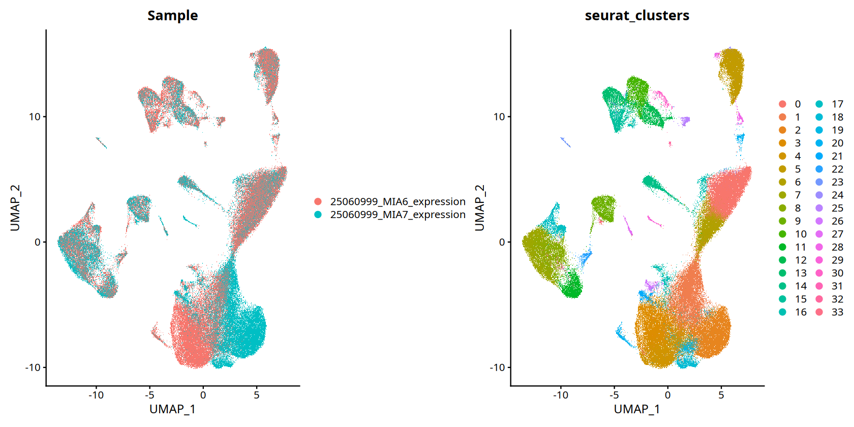
UMAP Visualization
Functionality Overview:
UMAP (Uniform Manifold Approximation and Projection) is one of the most common visualization methods in single-cell and spatial transcriptomics. It projects high-dimensional gene expression data into 2D space, preserving cell similarity relationships.
Visualization Content:
- Group by Sample (
SAMple): Show distribution of cells from different samples in reduced space, evaluating batch correction. - Group by Cluster (
Seurat_clusters): Show distribution of different cell groups, identifying cell types and subsets. - Cell Type Grouping (
celltype): Distinguish by tissue cell type specific markers.
Figure Legend (UMAP Visualization):
Figure below shows cell distribution in reduced space, grouped by sample or cluster.
- Meaning of Points: Each point represents a cell.
- Distance Relation: Points close together indicate similar cell expression profiles.
- Color Grouping: Points of same color or marker belong to same category (sample or cell type).
- Batch Correction Assessment: Same cell types from different samples should cluster together, indicating successful batch correction.
# --- UMAP Visualization ---
# options(): Set figure output dimensions (height and width in inches)
# repr.plot.height and repr.plot.width: Control figure display size in Jupyter notebook
options(repr.plot.height=7, repr.plot.width=14)

# DimPlot(): Seurat dimensionality reduction visualization function
# Parameter Description:
#   - obj.integrated: Seurat object (If your variable name is data, please replace with data)
#   - reduction = 'umap': Use UMAP results for visualization
#   - group.by: Specify grouping variable, can be vector (c()) containing multiple grouping methods
#     * "stim": Group by sample
#     * "RNA_snn_res.0.8": Group by clustering results (resolution 0.8)
DimPlot(data, reduction = 'umap', group.by=c("Sample","seurat_clusters"))To disable this behavior set \`raster=FALSE\`
Rasterizing points since number of points exceeds 100,000.
To disable this behavior set \`raster=FALSE\`
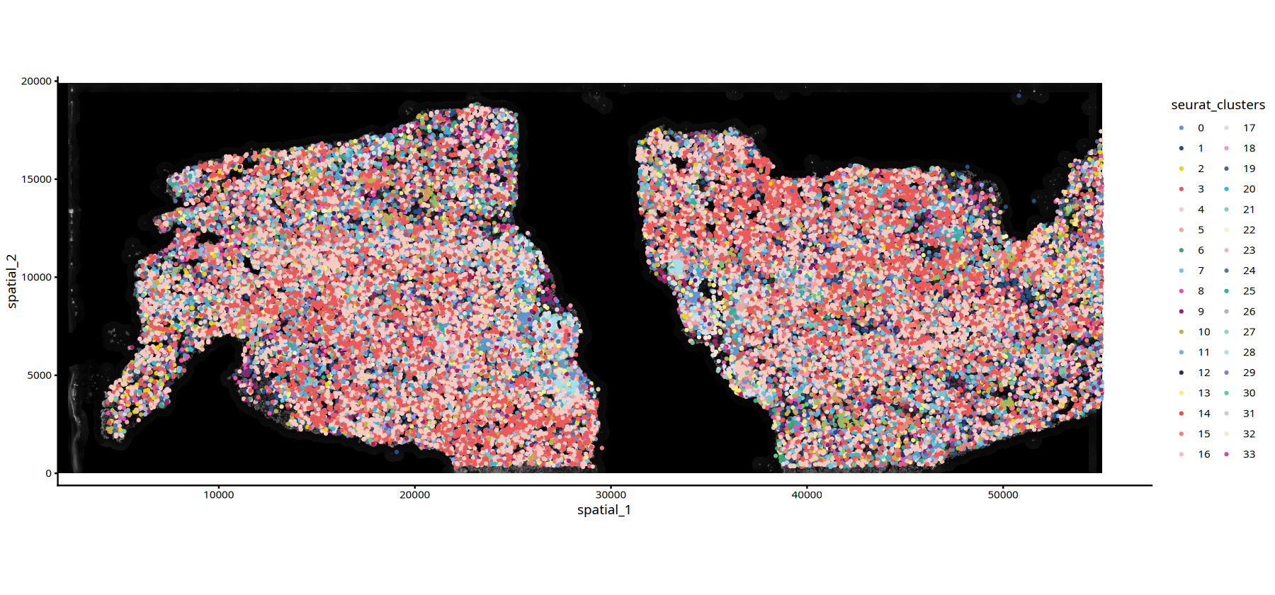
Spatial Visualization
Functionality Overview:
The core advantage of spatial transcriptomics is preserving original cell spatial locations. By setting reduction parameter to "spatial", we can plot cells on actual tissue coordinates, observing distribution patterns of cell types or features.
Visualization Content:
- Display actual spatial locations of cells in tissue sections.
- Can display grouped by sample, clustering result, or other metadata.
- Used to analyze spatial distribution patterns of cell types and identify spatial heterogeneity.
Parameter Description:
reduction = 'spatial': Use spatial coordinates for visualization.subset = stim=="SampleName": Filter specific sample for visualization.pt.size: Control point size, adjust according to cell density.
Application Scenarios:
- Identify spatial distribution patterns of cell types.
- Analyze tissue structure in different regions.
- Study spatially related biological processes.
# --- Spatial Visualization for Sample MIA6 ---
# Set figure output size
options(repr.plot.height=7, repr.plot.width=15)

# subset(): Filter data for specific sample
#   - obj.integrated: Seurat object
#   - subset = stim=="MIA6": Filter cells with sample ID "MIA6"
# DimPlot(): Spatial visualization
#   - reduction = 'spatial': Use spatial coordinates for visualization
#   - pt.size = 1: Set point size (adjust as needed, e.g., 0.5-2.0)
DimPlot(subset(data,subset=Sample=="25060999_MIA6_expression"), reduction = 'spatial',pt.size = 1)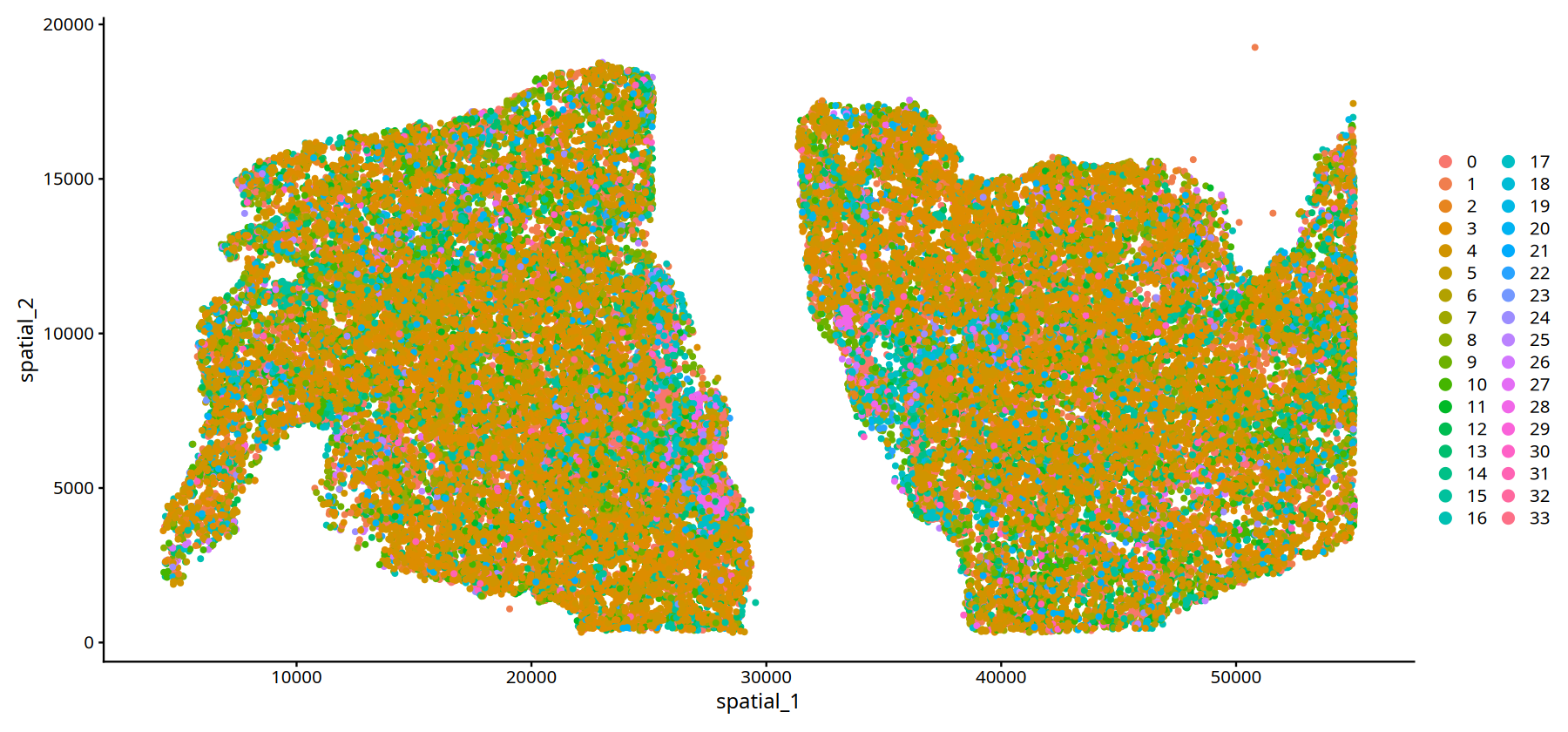
# --- Spatial Visualization for Sample MIA7 ---
# Set figure output size
options(repr.plot.height=7, repr.plot.width=15)

# Filter cells with sample ID "MIA7" and plot spatial location
# Parameters same as above
DimPlot(subset(data,subset=Sample=="25060999_MIA7_expression"), reduction = 'spatial',pt.size = 1)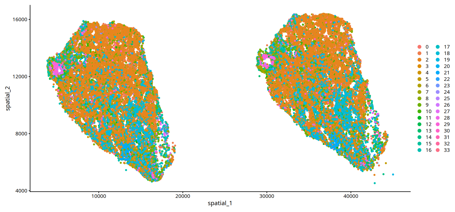
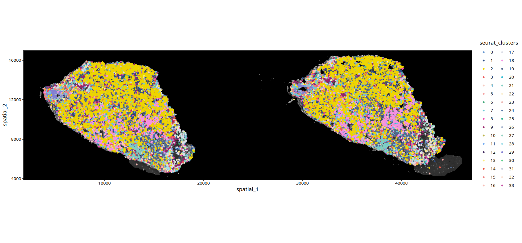
Custom Spatial Plotting Functions
For more flexible spatial transcriptomics display, we customized two plotting functions to overlay cell info on tissue image backgrounds:
Functionality:
ImageSpacePlot: Plot cell grouping info- Display cell clustering results on tissue image background (HE or DAPI).
- Different colors represent different cell types/clusters.
- Suitable for displaying spatial distribution patterns of cell types.
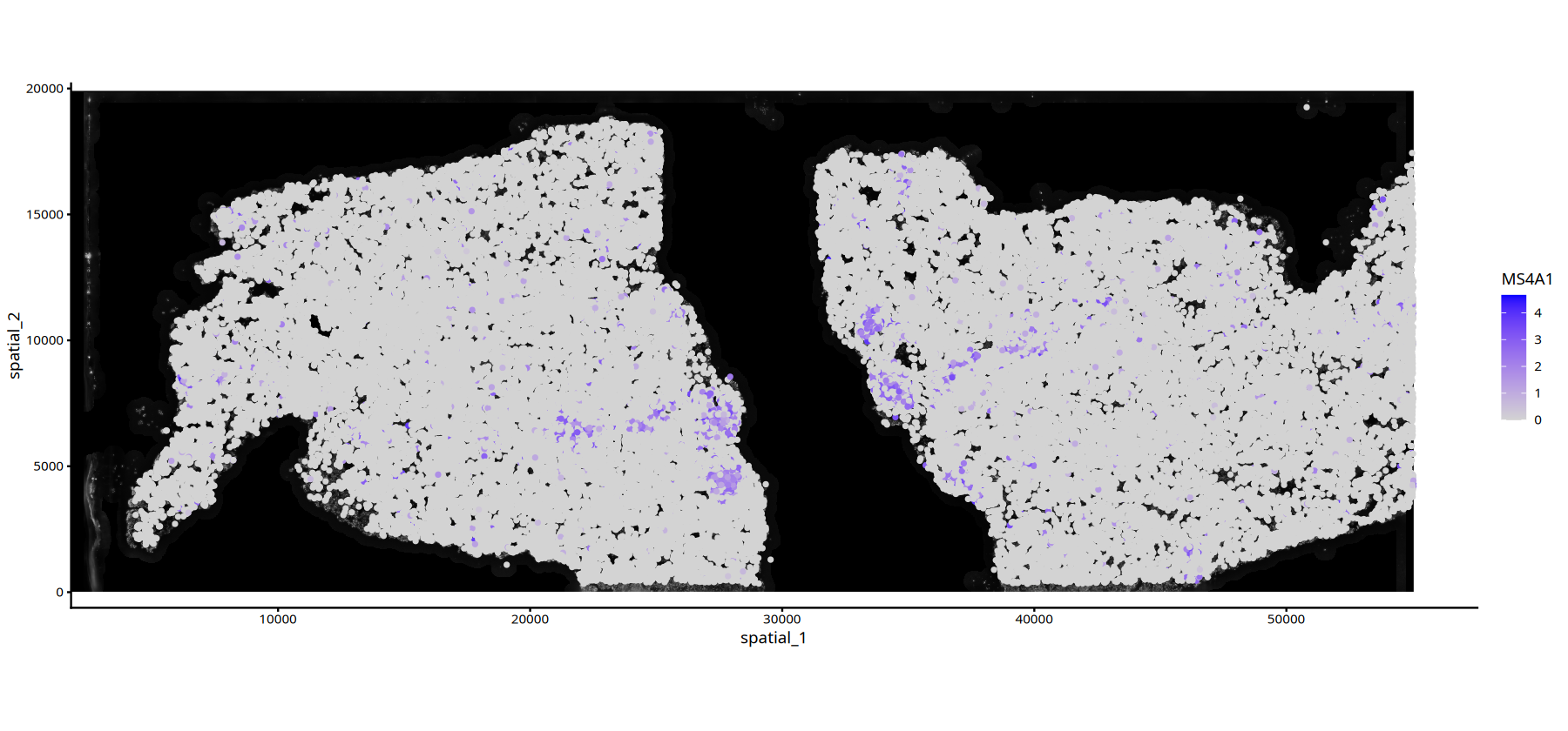
FeatureSpacePlot: Plot continuous variables (e.g., gene expression)- Display distribution of continuous variables (e.g., gene expression) on tissue image background.
- Use color gradient to represent value magnitude.
- Suitable for displaying spatial expression patterns of specific genes or features.
Usage Advantages:
- Combines histological information for more intuitive data understanding.
- Can choose different background image types (HE or DAPI).
- Can flexibly adjust point size, transparency, and color schemes.
# ============================================================================
# Define Custom Spatial Plotting Functions
# ============================================================================

# --- ImageSpacePlot Function: Plot Cell Clustering Information ---
# Function: Plot cell clustering/grouping results on tissue image background
#
# Parameter Description:
#   - obj: Seurat object containing spatial transcriptomics data
#   - group_by: String, specify metadata column name for grouping (e.g., clustering result column name)
#   - type: String, "DAPI" or "HE", specify background image type
#   - sample: String, specify sample name to visualize (default uses first sample)
#   - size: Numeric, control point size (default 1)
#   - alpha: Numeric, control point transparency (0-1, default 1 is fully opaque)
#   - color: Color vector, custom color scheme (default uses predefined MYCOLOR)
#
ImageSpacePlot = function(obj, group_by, type="DAPI", sample=names(obj@misc$info)[1], size=1, alpha=1,color=MYCOLOR){
    # Define default color scheme (40 colors, sufficient for most clustering results)
    MYCOLOR=c(
          "#6394ce", "#2a4c87", "#eed500", "#ed5858",
          "#f6cbc2", "#f5a2a2", "#3ca676", "#6cc9d8",
          "#ef4db0", "#992269", "#bcb34a", "#74acf3",
          "#3e275b", "#fbec7e", "#ec4d3d", "#ee807e",
          "#f7bdb5", "#dbdde6", "#f591e1", "#51678c",
          "#2fbcd3", "#80cfc3", "#fbefd1", "#edb8b5",
          "#5678a8", "#2fb290", "#a6b5cd", "#90d1c1",
          "#a4e0ea", "#837fd3", "#5dce8b", "#c5cdd9",
          "#f9e2d6", "#c64ea4", "#b2dfd6", "#dbdfe7",
          "#dff2ec", "#cce8f3", "#e74d51", "#f7c9c4",
          "#f29c81", "#c9e6e0", "#c1c5de", "#750000"
          )

    # Select corresponding raster image data based on image type
    raster_type <- switch(type,
                          HE = "img_he_gg",      # HE stained image
                          DAPI = "img_gg",       # DAPI stain image
                          stop("Invalid type. Must be 'HE' or 'DAPI'.")
                             )

    # Extract grouping information (e.g., clustering results)
    spatial_coord1 <- as.data.frame(obj[[group_by]])
    colnames(spatial_coord1) <- group_by
    # Extract spatial coordinate information
    spatial_coord2 <- as.data.frame(obj@reductions$spatial@cell.embeddings)
    # Merge spatial coordinates and grouping information
    spatial_coord <-cbind(spatial_coord2,spatial_coord1)

    # Plot using ggplot2
    # 1. Add background image (annotation_custom)
    # 2. Add cell points (geom_point), colored by grouping information
    ImageSpacePlot <- ggplot2::ggplot() +
        ggplot2::annotation_custom(grob = obj@misc$info[[sample]][[raster_type]],
                                   xmin = 0, xmax = obj@misc$info[[sample]]$size_x,
                                   ymin = 0, ymax = obj@misc$info[[sample]]$size_y) +
        ggplot2::geom_point(data = spatial_coord,
                           ggplot2::aes(x = spatial_1, y = spatial_2,
                                       color = !!sym(group_by),
                                       fill = !!sym(group_by)),
                           size=size, alpha=alpha)+
        labs(size = group_by) + guides(alpha = "none")+
        ggplot2::theme_classic()+
        scale_color_manual(values = color)+ coord_fixed()
    return(ImageSpacePlot)
}

# --- FeatureSpacePlot Function: Plot Continuous Variables (e.g., Gene Expression) ---
# Function: Plot spatial distribution of continuous variables (e.g., gene expression) on tissue image background
#
# Parameter Description:
#   - obj: Seurat object containing spatial transcriptomics data
#   - feature: String, specify feature to visualize (e.g., gene name or metadata column name)
#   - type: String, "DAPI" or "HE", specify background image type
#   - sample: String, specify sample name to visualize
#   - size: Numeric, control point size
#   - alpha: Numeric vector, control transparency range (c(min, max))
#   - color: Color vector, define color gradient (c(low value color, high value color))
#
FeatureSpacePlot = function(obj, feature, type="DAPI", sample=names(obj@misc$info)[1], size=1, alpha=c(1,1),color=c("lightgrey","blue")){
    # Select corresponding raster image data based on image type
    raster_type <- switch(type,
                          HE = "img_he_gg",
                          DAPI = "img_gg",
                          stop("Invalid type. Must be 'HE' or 'DAPI'.")
                             )

    # Extract spatial coordinate information
    spatial_coord1 <- as.data.frame(obj@reductions$spatial@cell.embeddings)
    # Extract feature data (e.g., gene expression)
    spatial_coord2 <- FetchData(obj,feature)
    colnames(spatial_coord2) <- feature
    # Merge spatial coordinates and feature data
    spatial_coord <-cbind(spatial_coord1,spatial_coord2)

    # Plot using ggplot2
    # 1. Add background image
    # 2. Add cell points, colored by feature value and adjusted transparency
    FeatureSpacePlot <-ggplot2::ggplot() +
        ggplot2::annotation_custom(grob = obj@misc$info[[sample]][[raster_type]],
                                   xmin = 0, xmax = obj@misc$info[[sample]]$size_x,
                                   ymin = 0, ymax = obj@misc$info[[sample]]$size_y) +
        ggplot2::geom_point(data = spatial_coord,
                           ggplot2::aes(x = spatial_1, y = spatial_2,
                                       color = !!sym(feature),
                                       alpha = !!sym(feature)),
                           size=size)+
        labs(color = feature)+
        guides(alpha = "none")+
        ggplot2::theme_classic()+
        ggplot2::scale_alpha_continuous(range=alpha)+
        scale_color_gradient(low=color[1],high = color[2])+ coord_fixed()
    return(FeatureSpacePlot)
}# --- Use ImageSpacePlot to Plot Cell Clustering for Sample MIA6 ---
# Set figure output size
options(repr.plot.height=7, repr.plot.width=15)
# ImageSpacePlot(): Custom function to plot cell clustering on tissue image background
# Parameter Description:
# - subset(): Filter cells with sample ID "MIA6"
# - group_by = "seurat_clusters": Color by clustering results
# - type = "DAPI": Use DAPI stained image as background
# - size = 0.7: Set point size to 0.7
# - sample = "25060999_MIA6_expression": Specify sample name
ImageSpacePlot(subset(data,subset=Sample=="25060999_MIA6_expression"),
group_by = "seurat_clusters",
type="DAPI",
size=0.7,
sample="25060999_MIA6_expression")• size : "seurat_clusters"
# --- Use ImageSpacePlot to Plot Cell Clustering for Sample MIA7 ---
# Set figure output size
options(repr.plot.height=7, repr.plot.width=15)

# Plot Cell Clustering for Sample MIA7
# Parameters same as above
ImageSpacePlot(subset(data,subset=Sample=="25060999_MIA7_expression"),
               group_by = "seurat_clusters",
               type="DAPI",
               size=0.7,
sample="25060999_MIA7_expression")• size : "seurat_clusters"
# Gene Expression Plot with DAPI Background
options(repr.plot.height=7, repr.plot.width=15)
FeatureSpacePlot(obj=subset(data,subset=Sample=="25060999_MIA6_expression"), feature="MS4A1",type="DAPI")