细胞占比差异分析:不同分组间的细胞比例箱线图绘制
时长: 8 分钟
字数: 1.6k 字
更新: 2026-03-02
阅读: 0 次
分组比例图
需要修改的参数
Seurat.ob 和 meta 读取的文件 data 后的 AYxxx 可以根据自己的注释流程进行修改
R
seurat.ob = readRDS("data/AY1734579787477/input.rds")
meta <- read.table("data/AY1734579787477/meta.tsv", header = T, sep = "\t", check.names = F)
seurat.ob <- AddMetaData(seurat.ob, meta)
DefaultAssay(seurat.ob) = "RNA"
基于细胞样本占比进行的校验统计,百分比是统计每个细胞类型在样本中的占比,cluster_obj 需要输入所有的细胞类型
R
prefix="Myeloid" # 保存图片名称前缀
group_name="Tissue"
groups_com = "AdjacentvsTumor"
cluster_name = "CellAnnotation"
cluster_obj = "Monocyte,Macrophage,DC" #注意排序
sample_name="Sample"
outdir="./"
dosave_fig="F" # 是否保存图片,只想看单个组的结果可以设置为 F,取消必须写 F
dogroup_test="T" # 是否增加组间校验,支持两组,两组以上可以取消,取消必须写 F
运行代码及图片展示
非必要无需修改
R
# 筛选数据
if (groups_com != ""){
    group_list=unlist(strsplit(groups_com,"vs"))
    sub = subset(seurat.ob,subset = !!sym(group_name) %in% group_list)
}
if (cluster_obj != ""){
    cluster_list = unlist(strsplit(cluster_obj,","))
    sub = subset(seurat.ob,subset = !!sym(cluster_name) %in% cluster_list)
}

# 计算每个细胞类型在各样本中的比例
cellratio = prop.table(table(sub@meta.data[[cluster_name]],sub@meta.data[[sample_name]]),margin = 2)
cellratio <- data.frame(cellratio)
cellper <- dcast(cellratio,Var2~Var1,value.var = "Freq")
rownames(cellper) <- cellper[,1]
#cellper <- cellper[,-1]

# 添加分组信息
samples <- sub@meta.data %>% select(!!sym(sample_name),!!sym(group_name)) %>% distinct()
colnames(samples) <- c("Sample","Group")
rownames(samples) <- samples$Sample
cellper$Sample <- samples[rownames(cellper),"Sample"]
cellper$Group <- samples[rownames(cellper),"Group"]

# 画图
pplist = list()
for (group_ in cluster_list){
    cellper_  = cellper %>% select(one_of(c('Sample','Group',group_)))
    colnames(cellper_) = c('Sample','Group','percent')
    cellper_$percent = as.numeric(cellper_$percent)
    cellper_ <- cellper_ %>% group_by(Group) %>% mutate(upper=quantile(percent,0.75),lower=quantile(percent,0.25),mean=mean(percent),median=median(percent))
    cellper1 = cellper_ %>% filter(Group %in% group_list)
    cellper1$Group = factor(cellper1$Group,levels = group_list)
    pp1 = ggplot(cellper1,aes(x=Group,y=percent,fill=Group)) +
        geom_boxplot()+theme_bw()+
        geom_jitter(shape = 21,aes(fill=Group),width = 0.25,height = 0) +
        theme(axis.text = element_text(size = 14),axis.title = element_text(size = 16),legend.text = element_text(size = 18),
              legend.title = element_text(size = 20),plot.title = element_text(size = 18,face = 'plain'),panel.grid=element_blank()) +
        labs(title = group_,y='Percentage')
    if (dogroup_test != "F"){
        labely = max(cellper1$percent)
        my_comparisons <- strsplit(groups_com, split = "vs")
        pp1 = pp1 + stat_compare_means(comparisons = my_comparisons,size = 3,method = "t.test")
    }
    pplist[[group_]] = pp1
}

if (length(pplist) >1){
    adjust_size <- function(n_plots, base_width = 15, base_height = 10) {
        ncol <- ceiling(sqrt(n_plots))
        nrow <- ceiling(n_plots / ncol)
        width <- base_width * ncol / 3 +2
        height <- base_height * nrow / 2
        list(width = width, height = height)
    }

    remove_x_axis <- function(p) {
        p + theme(axis.title.x = element_blank(),axis.text.x = element_blank(),axis.ticks.x = element_blank(),axis.title.y = element_blank())
    }

    y_title <- ggplot() +
        labs(y = "Percent(%)") +
        theme(
        plot.margin = margin(0, 0, 0, 10),
        axis.title.x = element_blank(),
        axis.text.x = element_blank(),
        axis.ticks.x = element_blank(),
        axis.title.y = element_text(angle = 90, hjust = 0.5),
        axis.text.y = element_blank(),
        axis.ticks.y = element_blank(),
        panel.background = element_blank(),
        panel.grid = element_blank(),
        axis.line = element_blank() ,axis.title = element_text(size = 20)
        )

    n_plots <- length(pplist)
    ncol <- ceiling(sqrt(n_plots))
    nrow <- ceiling(n_plots / ncol)
    sizes <- adjust_size(n_plots)
    pplist_modified <- lapply(pplist, remove_x_axis)
    pplist_no_legend <- lapply(pplist_modified, function(p) p + theme(legend.position="none"))
    combined_plot <- plot_grid(plotlist = pplist_no_legend, ncol = ncol, align = 'hv')
    final_plot <- plot_grid(y_title,combined_plot, get_legend(pp1), rel_widths = c(0.1,1, 0.2),nrow = 1)
    if (dosave_fig != "F") {
        ggsave(paste0(outdir,"/",prefix,"_",groups_com,"_group_cellratio.png"),final_plot,width = sizes$width, height = sizes$height,type="cairo-png")
        ggsave(paste0(outdir,"/",prefix,"_",groups_com,"_group_cellratio.pdf"),final_plot,width = sizes$width, height = sizes$height)
    }
}
options(repr.plot.height=sizes$height, repr.plot.width=sizes$width)
print(final_plot)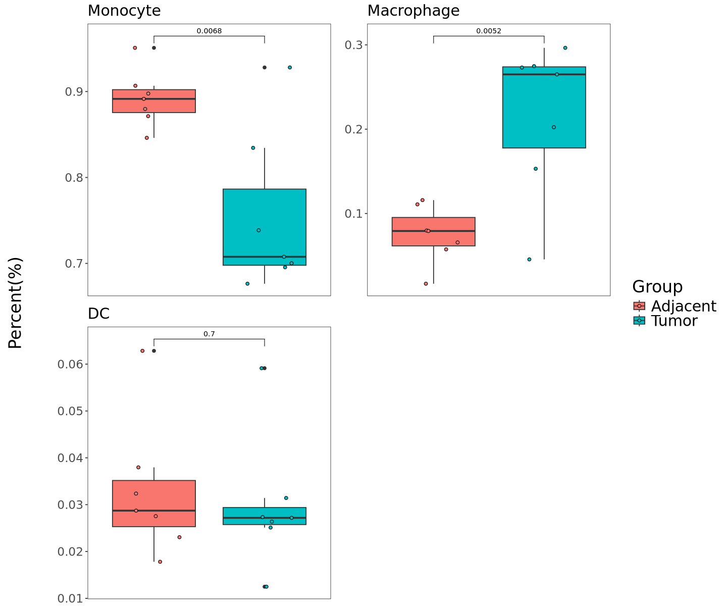
多组循环出图
定义单组绘图函数
R
cellration_barbox <- function(seurat.ob,prefix,group_name,groups_com,cluster_name,cluster_obj,sample_name,outdi,dosave_fig,dogroup_test){
# 筛选数据
if (groups_com != ""){
group_list=unlist(strsplit(groups_com,"vs"))
sub = subset(seurat.ob,subset = !!sym(group_name) %in% group_list)
}
if (cluster_obj != ""){
cluster_list = unlist(strsplit(cluster_obj,","))
sub = subset(seurat.ob,subset = !!sym(cluster_name) %in% cluster_list)
}
# 计算每个细胞类型在各样本中的比例
cellratio = prop.table(table(sub@meta.data[[cluster_name]],sub@meta.data[[sample_name]]),margin = 2)
cellratio <- data.frame(cellratio)
cellper <- dcast(cellratio,Var2~Var1,value.var = "Freq")
rownames(cellper) <- cellper[,1]
#cellper <- cellper[,-1]
# 添加分组信息
samples <- sub@meta.data %>% select(!!sym(sample_name),!!sym(group_name)) %>% distinct()
colnames(samples) <- c("Sample","Group")
rownames(samples) <- samples$Sample
cellper$Sample <- samples[rownames(cellper),"Sample"]
cellper$Group <- samples[rownames(cellper),"Group"]
# 画图
pplist = list()
for (group_ in cluster_list){
cellper_ = cellper %>% select(one_of(c('Sample','Group',group_)))
colnames(cellper_) = c('Sample','Group','percent')
cellper_$percent = as.numeric(cellper_$percent)
cellper_ <- cellper_ %>% group_by(Group) %>% mutate(upper=quantile(percent,0.75),lower=quantile(percent,0.25),mean=mean(percent),median=median(percent))
cellper1 = cellper_ %>% filter(Group %in% group_list)
cellper1$Group = factor(cellper1$Group,levels = group_list)
pp1 = ggplot(cellper1,aes(x=Group,y=percent,fill=Group)) +
geom_boxplot()+theme_bw()+
geom_jitter(shape = 21,aes(fill=Group),width = 0.25,height = 0) +
theme(axis.text = element_text(size = 14),axis.title = element_text(size = 16),legend.text = element_text(size = 18),
legend.title = element_text(size = 20),plot.title = element_text(size = 18,face = 'plain'),panel.grid=element_blank()) +
labs(title = group_,y='Percentage')
if (dogroup_test != "F"){
labely = max(cellper1$percent)
my_comparisons <- strsplit(groups_com, split = "vs")
pp1 = pp1 + stat_compare_means(comparisons = my_comparisons,size = 3,method = "t.test")
}
pplist[[group_]] = pp1
}
if (length(pplist) >1){
adjust_size <- function(n_plots, base_width = 15, base_height = 10) {
ncol <- ceiling(sqrt(n_plots))
nrow <- ceiling(n_plots / ncol)
width <- base_width * ncol / 3 +2
height <- base_height * nrow / 2
list(width = width, height = height)
}
remove_x_axis <- function(p) {
p + theme(axis.title.x = element_blank(),axis.text.x = element_blank(),axis.ticks.x = element_blank(),axis.title.y = element_blank())
}
y_title <- ggplot() +
labs(y = "Percent(%)") +
theme(
plot.margin = margin(0, 0, 0, 10),
axis.title.x = element_blank(),
axis.text.x = element_blank(),
axis.ticks.x = element_blank(),
axis.title.y = element_text(angle = 90, hjust = 0.5),
axis.text.y = element_blank(),
axis.ticks.y = element_blank(),
panel.background = element_blank(),
panel.grid = element_blank(),
axis.line = element_blank() ,axis.title = element_text(size = 20)
)
n_plots <- length(pplist)
ncol <- ceiling(sqrt(n_plots))
nrow <- ceiling(n_plots / ncol)
sizes <- adjust_size(n_plots)
pplist_modified <- lapply(pplist, remove_x_axis)
pplist_no_legend <- lapply(pplist_modified, function(p) p + theme(legend.position="none"))
combined_plot <- plot_grid(plotlist = pplist_no_legend, ncol = ncol, align = 'hv')
final_plot <- plot_grid(y_title,combined_plot, get_legend(pp1), rel_widths = c(0.1,1, 0.2),nrow = 1)
if (dosave_fig != "F") {
ggsave(paste0(outdir,"/",prefix,"_",groups_com,"_group_cellratio.png"),final_plot,width = sizes$width, height = sizes$height,type="cairo-png")
ggsave(paste0(outdir,"/",prefix,"_",groups_com,"_group_cellratio.pdf"),final_plot,width = sizes$width, height = sizes$height)
}
}
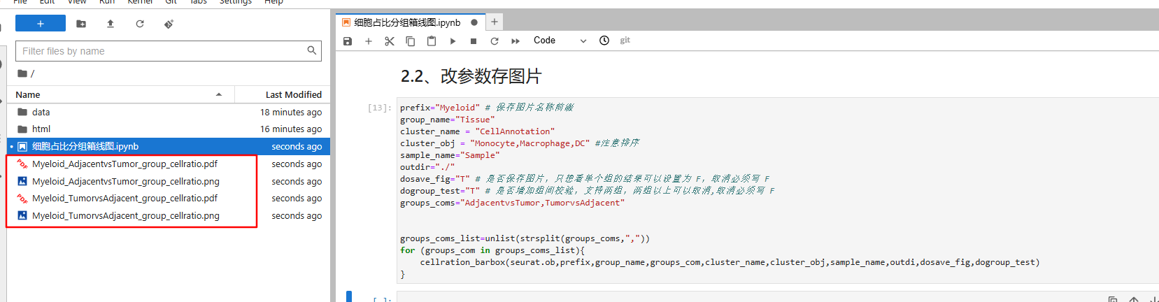
}改参数存图片
R
prefix="Myeloid" # 保存图片名称前缀
group_name="Tissue"
cluster_name = "CellAnnotation"
cluster_obj = "Monocyte,Macrophage,DC" #注意排序
sample_name="Sample"
outdir="./"
dosave_fig="T" # 是否保存图片,只想看单个组的结果可以设置为 F,取消必须写 F
dogroup_test="T" # 是否增加组间校验,支持两组,两组以上可以取消,取消必须写 F
groups_coms="AdjacentvsTumor,TumorvsAdjacent"

# 下面无需修改
groups_coms_list=unlist(strsplit(groups_coms,","))
for (groups_com in groups_coms_list){
    cellration_barbox(seurat.ob,prefix,group_name,groups_com,cluster_name,cluster_obj,sample_name,outdi,dosave_fig,dogroup_test)
}
会在 outdir 指定路径下存储相关图片